In Design Motif Tutorials Part I, you learned how to make a lovely roses and swirls design. For Part II, I wanted to go a bit less feminine, and step up the playfulness factor! In today’s tutorial, you’ll learn how to make some colorful and simple citrus fruits that will add some zest (ha) to your paper creations!
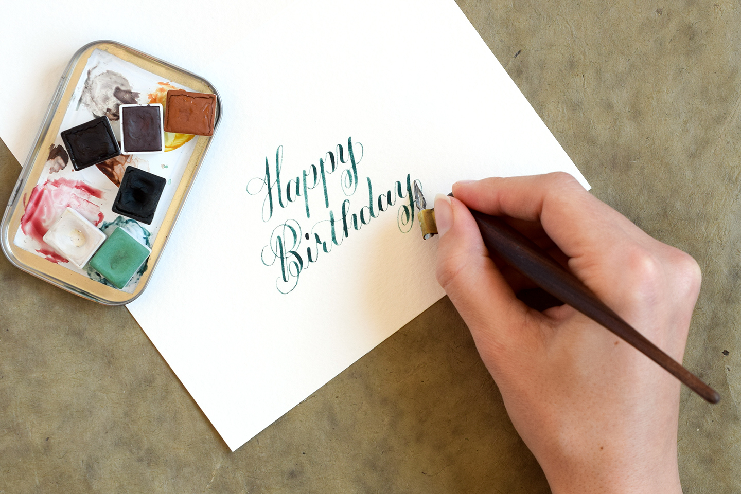
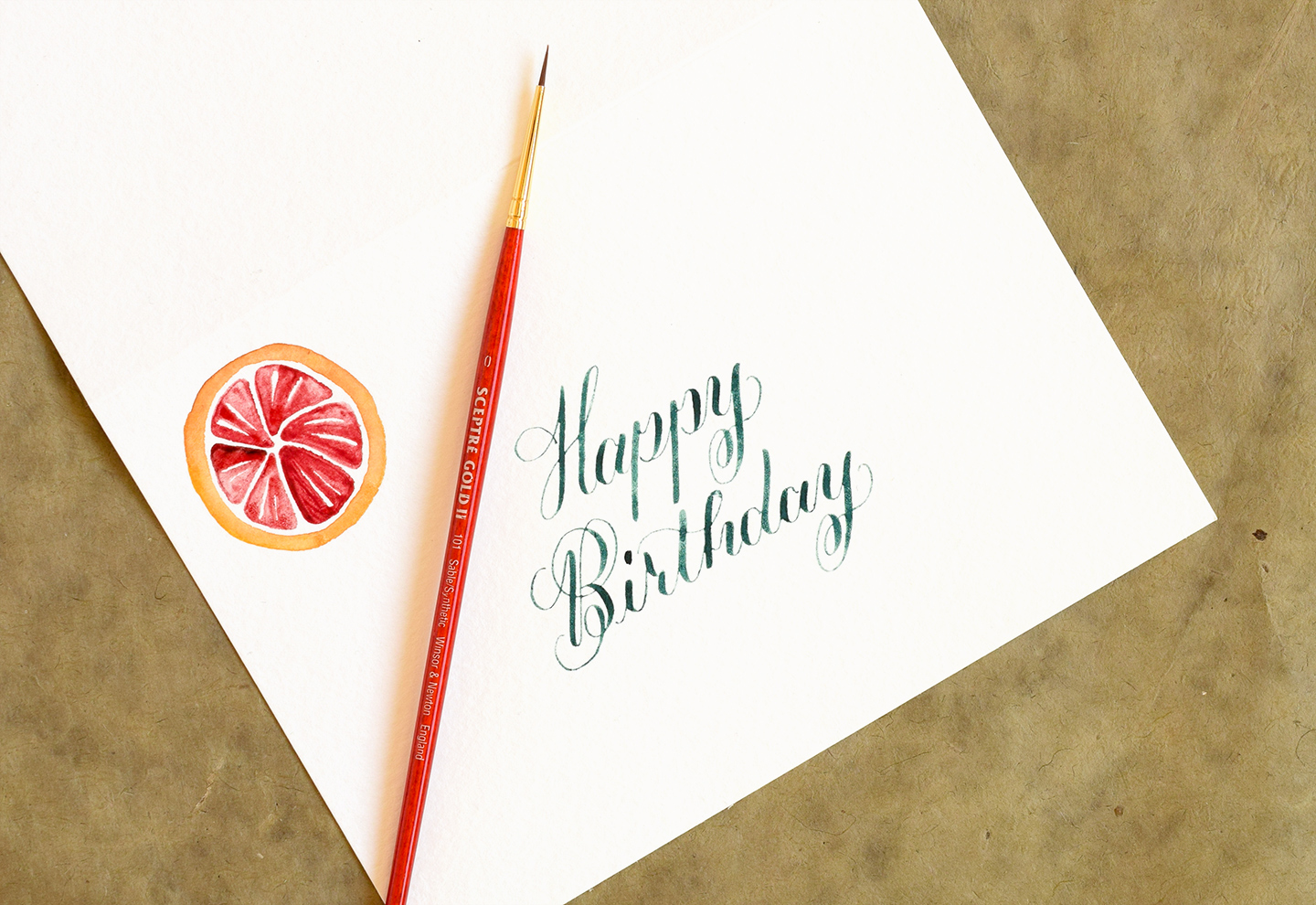
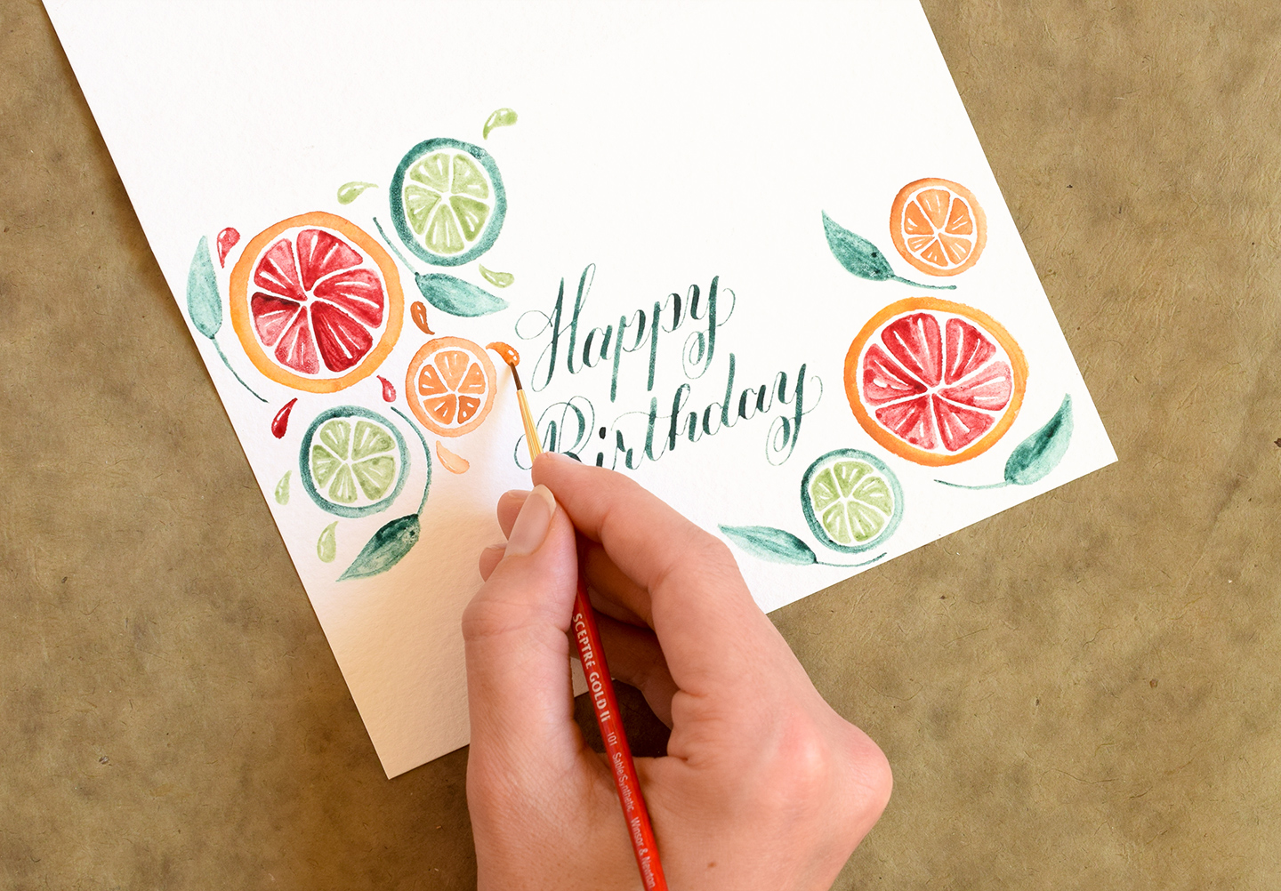
I’ll be making a birthday card today in order to show you how to paint the fruits; but you can use this design motif on anything you want! Gift tags, bookmarks, wall art, and DIY wrapping paper are all good examples of great projects you could make using citrus fruit artwork. As for me — I am going to start by writing “Happy Birthday” in Janet Style calligraphy on an A7 watercolor paper card. In the photo below, I am using the watercolor calligraphy technique so I can match the color of my calligraphy with the color of the limes I’ll be painting soon.

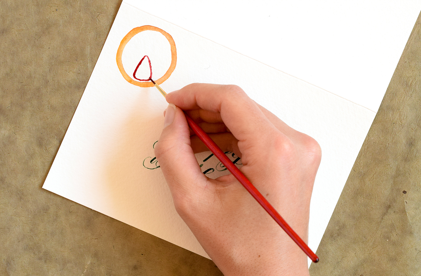
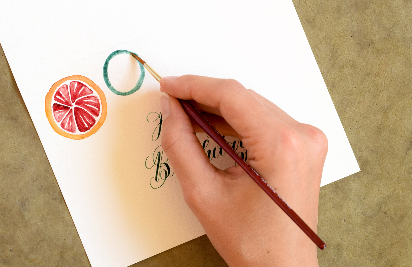
If you opt to make a card like this, you’ll want to wait until your calligraphy is dry; then draw an orange watercolor circle like the one pictured below using a medium-sized brush (size 2 or so). This orange watercolor circle will soon turn into a grapefruit; the circle represents the fruit’s rind!

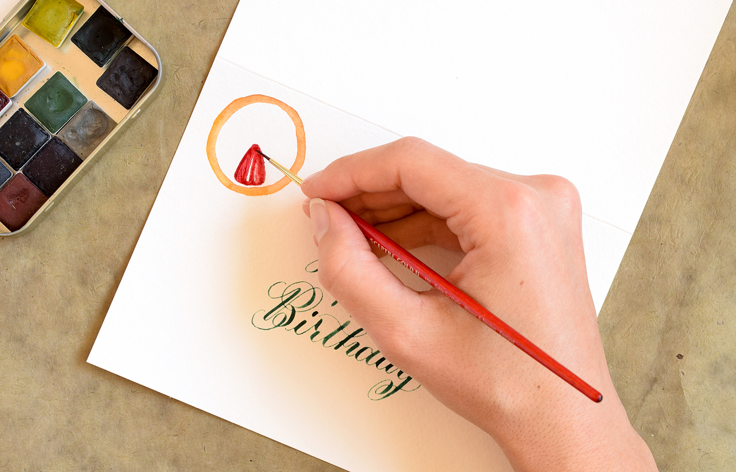
Take a smaller paintbrush (~size 0) and paint a red triangle inside the circle you just drew. The tip of the triangle should be pointing toward the center of the circle, and the bottom of the triangle should be parallel to the edge of the circle. Make sure all of the points of the triangle are rounded; this will result in a more realistic-looking final product.

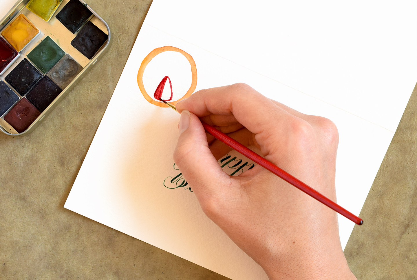
Fill in the left 1/3 of the triangle with red watercolor paint.

After you paint the 1/3, lift up your paintbrush and paint a line that goes through the center of the triangle. You should have some white space between the block of color you originally painted and the line you just painted. That’s good! Don’t paint in that space.

Try to leave another little sliver of white space after the middle line you painted, then go ahead and fill in the right 1/3 of your triangle.

It’s important to ensure your triangle has slivers of white because the white represents highlights. When you look at a sliced citrus fruit, light bounces off of the fruit because it’s wet. That light-bouncing effect is what the white mimics here!

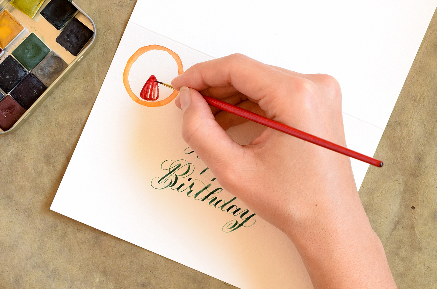
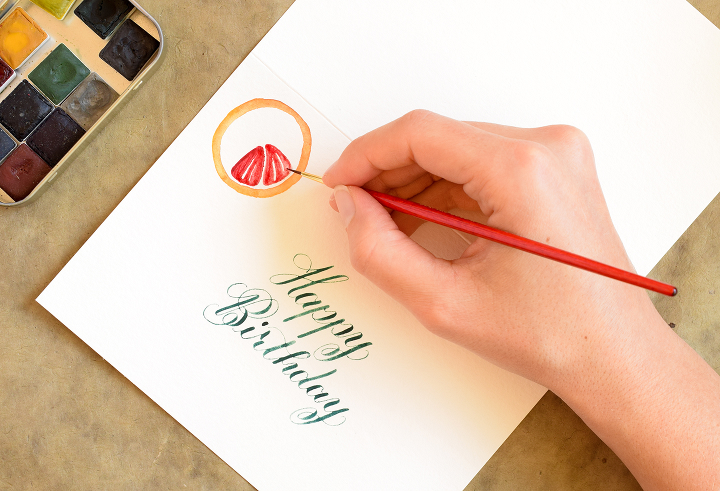
Once you finish your first triangle, paint a second triangle to the right of it. Make sure there’s a nice sliver of white space between the first triangle and the second triangle! It’s okay if you need to curve the left side of this new triangle you are drawing to better fill up space in the circle. In the photo below, you can see that the left edge of the triangle I am painting is “hugging” the right edge of my first triangle.

Follow the same painting process that you used with the first triangle to fill in the second triangle. If you can, vary where the white slivers show up in this new triangle (versus where you put the slivers in the first triangle)!

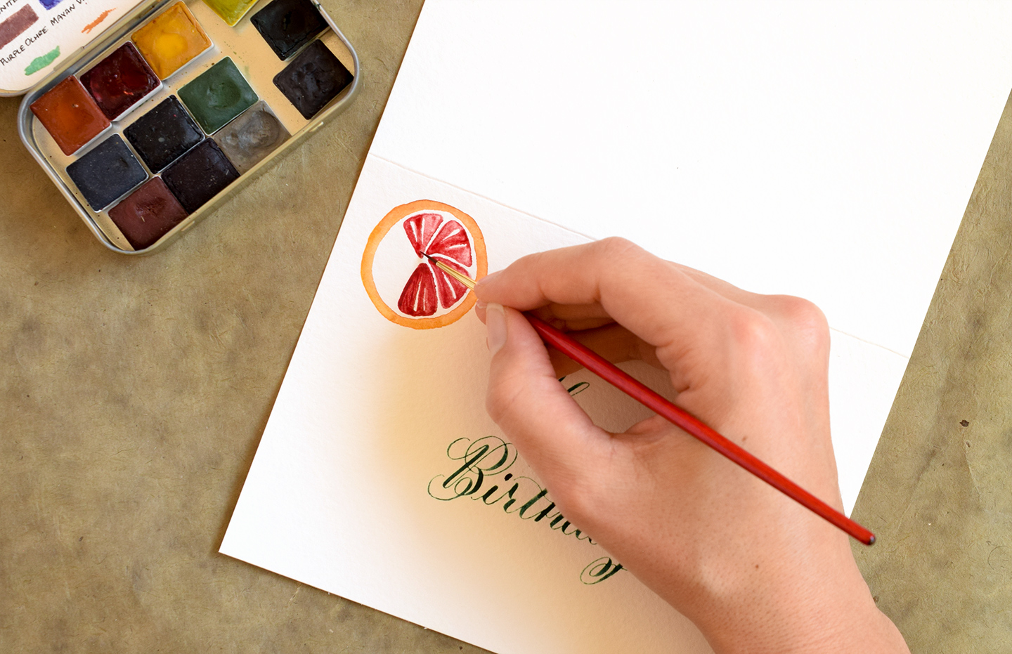
Continue to paint red triangles with white slivers until your circle is filled up!


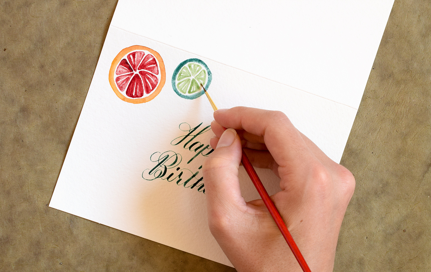
Once your grapefruit is finished, it’s time to move on to painting a lime. The creation process is exactly the same, except you’ll be using different colors! Start with a dark green circle to represent the rind. You might want to make this circle smaller than the grapefruit so you have some nice size variation!

Use a lighter green color to fill in the inside just as you did with the grapefruit.

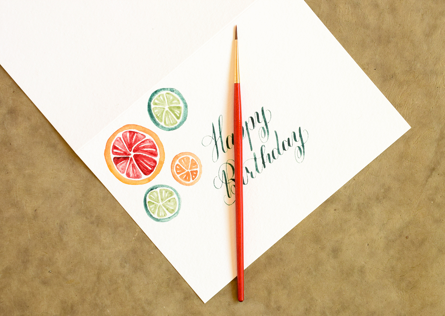
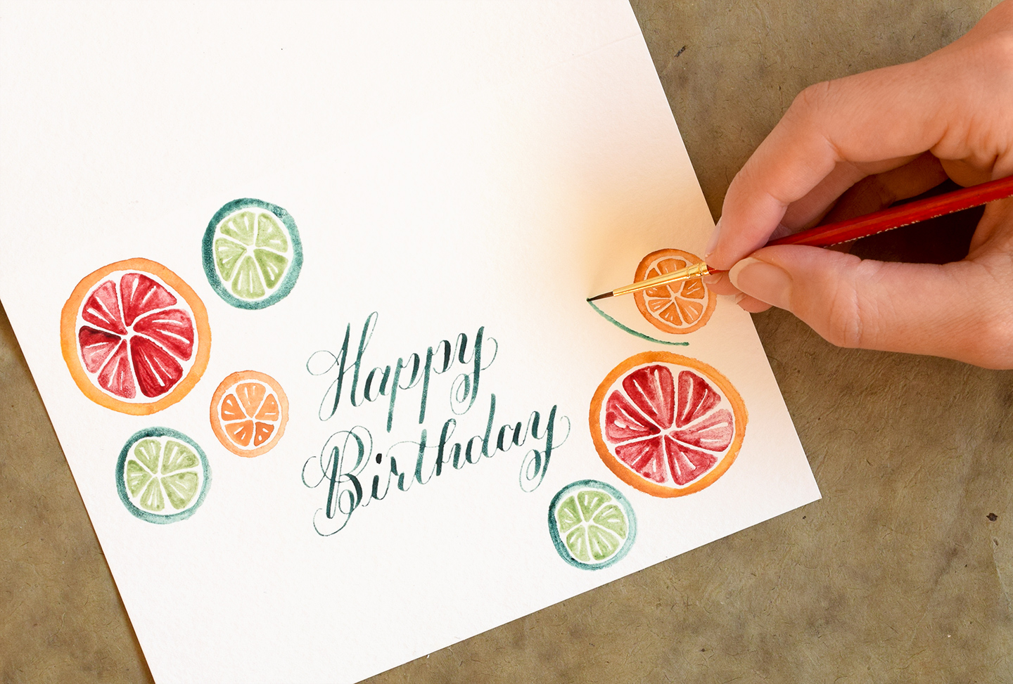
Draw as many fruits as you like in order to fill up your space! You can see here that I’ve got one grapefruit, two limes, and one clementine.

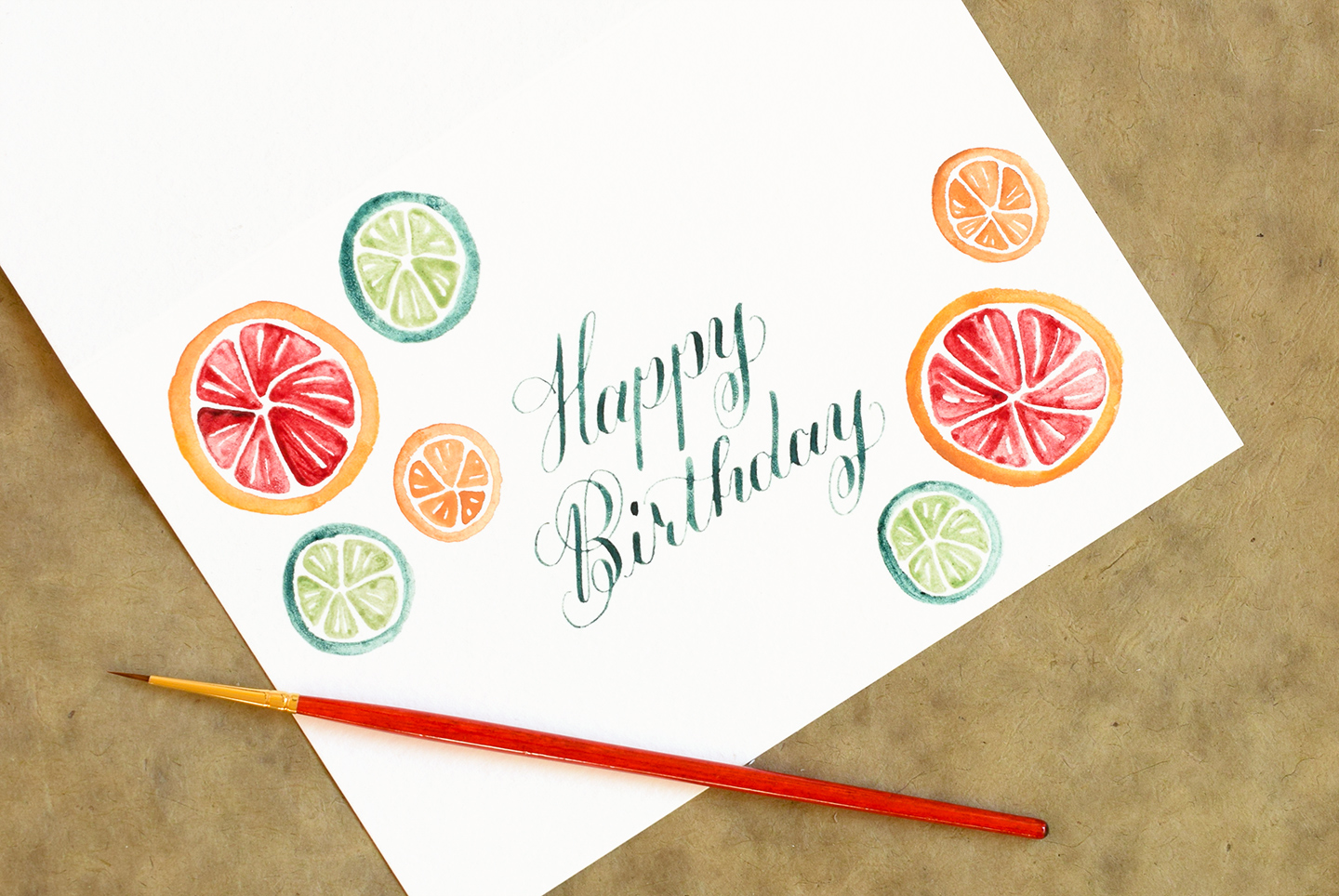
Depending on the size/shape of your project, you may want to add more fruits. I added a grapefruit, a clementine, and a lime on the bottom right of my card to fill up the space a little more without overpowering the “Happy Birthday” calligraphy.

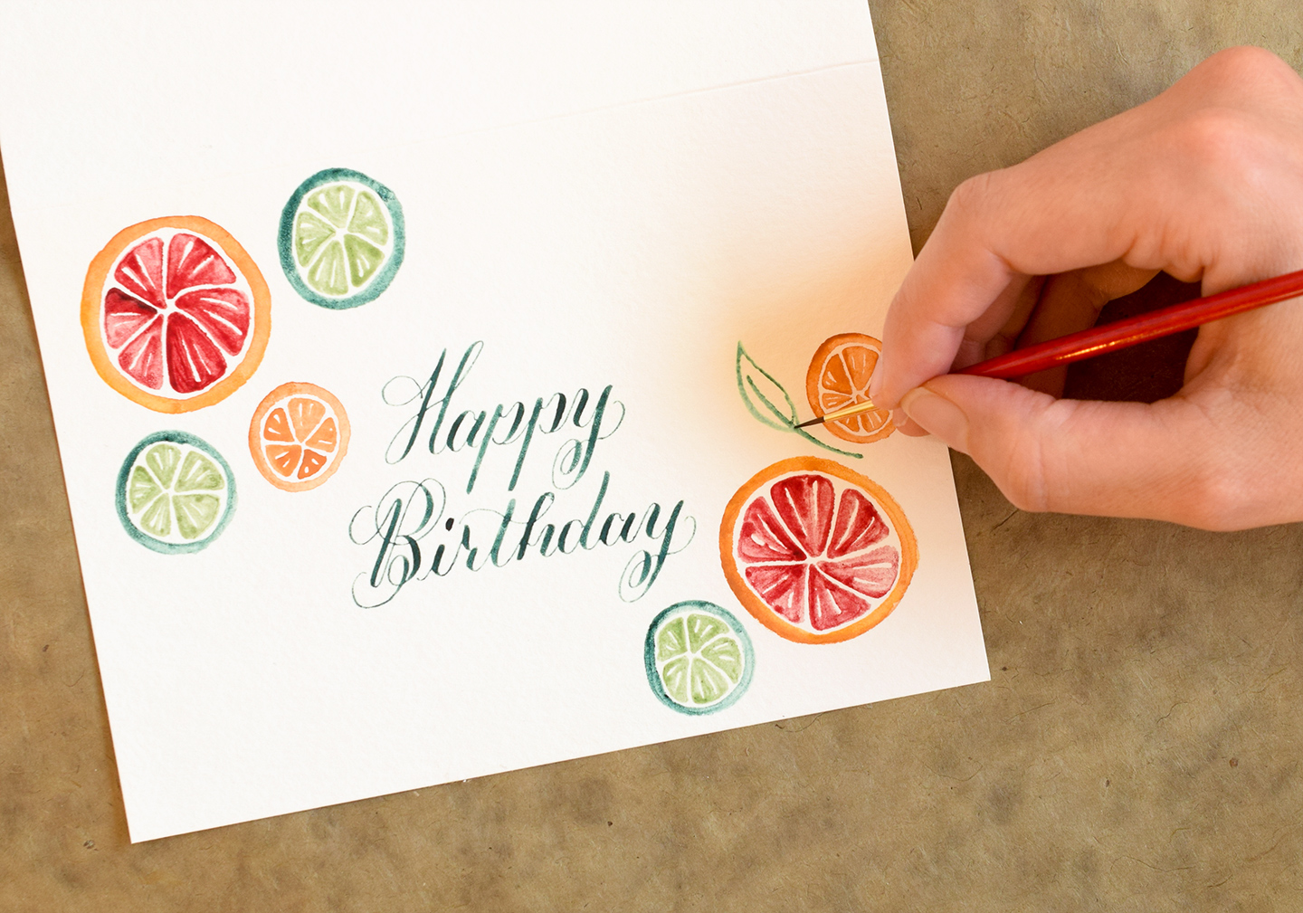
You could leave your citrus illustrations as-is, but I like to add leaves to further fill up the space and add some motion to the piece! To draw a leaf, start by painting a curved green line that originates between two fruits.

Next, paint a leaf-shaped outline around the stem as shown in the photo below.

Fill in the leaf outline, and you’re finished with the first leaf!

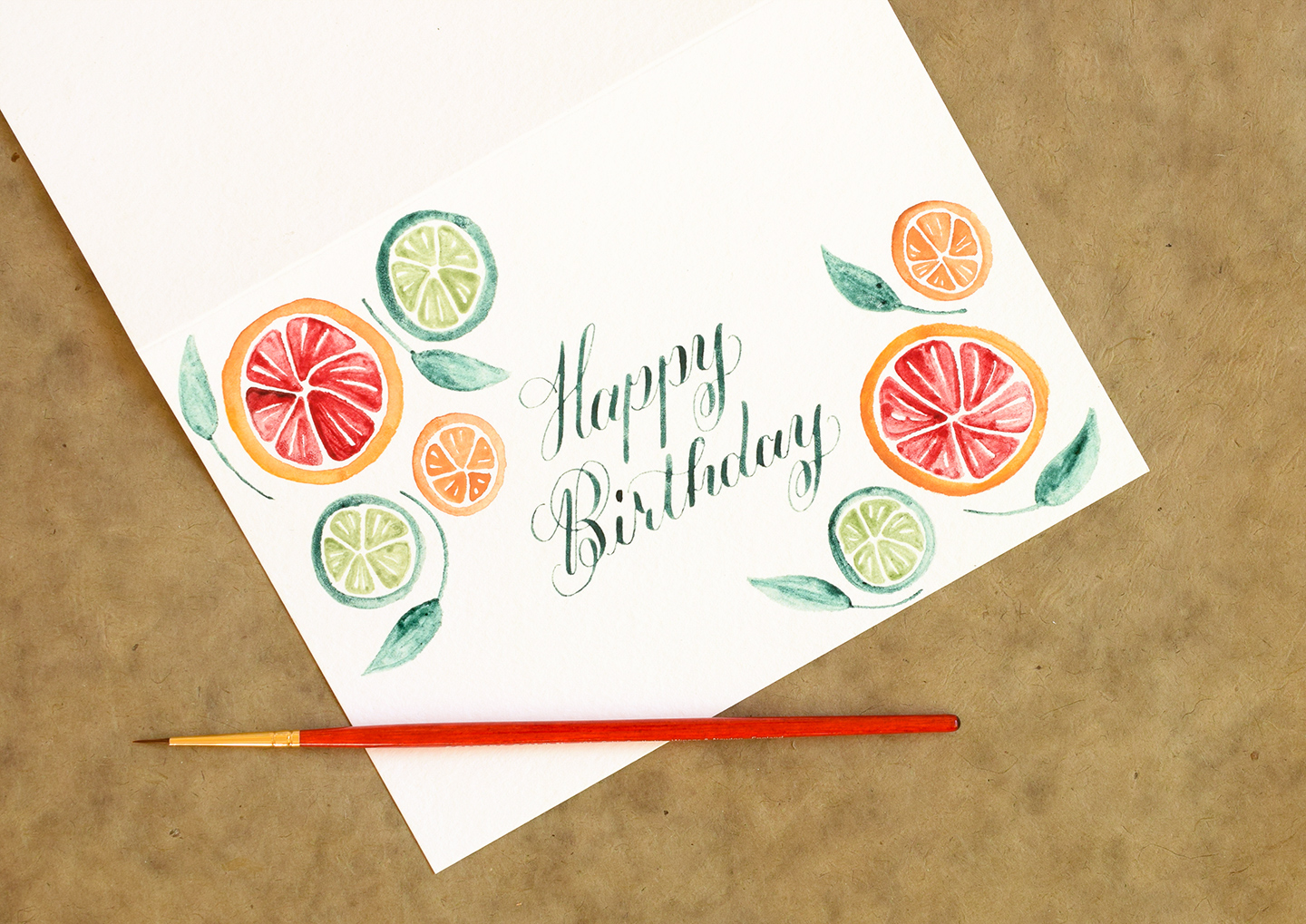
Use the same process to paint a few more leaves at random. Make sure all of them have curved stems that hug the curves of the citrus fruits.

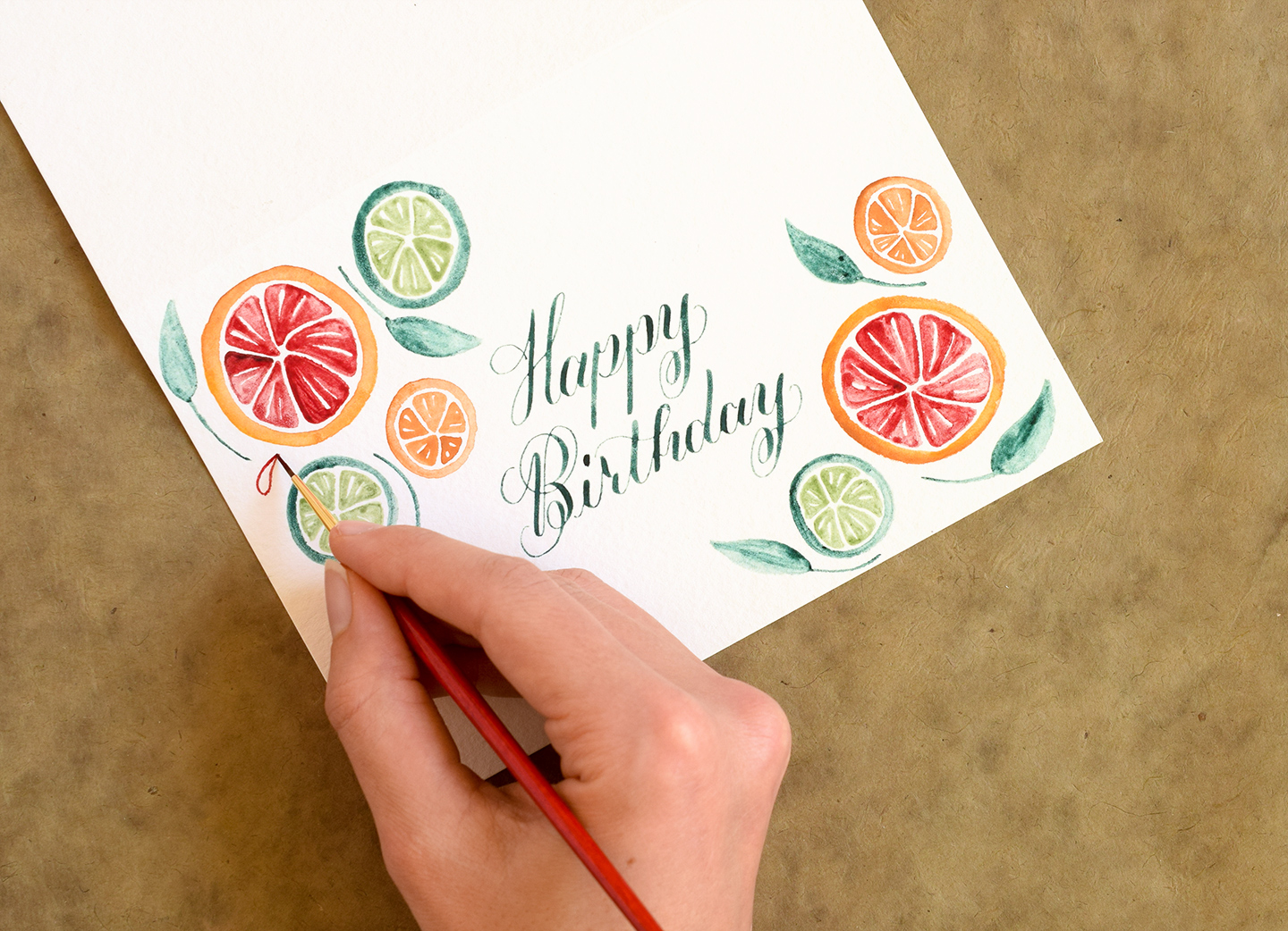
To finish up, you’ll want to paint a few droplets of juice. To create a droplet, you’ll start with a curved teardrop-shaped outline like the one pictured below. Notice that I’m using the same color of red that I used for the inside of the grapefruit!

Fill in the teardrop, making sure to include a thin white sliver along the top edge. Again, this white sliver represents light bouncing off the droplet, and makes it look more realistic.

Continue to paint droplets in random places around the fruits and leaves. Make sure the colors you use for the droplets correspond with the colors you used to paint the inside of the fruits!

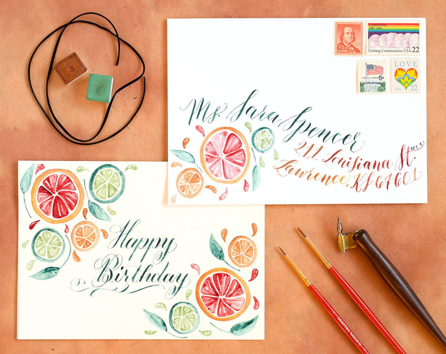
Your final product will look something like the piece below.

Of course, if you opt to use the citrus fruits motif for a card, you can always make an envelope with a corresponding design! On the envelope below, I’ve paired fruit illustrations with watercolor Kaitlin Style calligraphy to create colorful and eye-catching mail art!

I love this design motif because it achieves a perfect balance between playful and artistic. There’s a lot of fun energy in it, which makes it enjoyable to look at!

While I have used a birthday card and envelope to demonstrate the design motif in this blog post, I want to reiterate that you can use this design concept for anything! I mean, how cool would it be to paint some clusters of fruit on an 8″x10″ piece of watercolor paper, frame it, and put it in your kitchen? Remember: using artist-grade watercolors will make for vivid, long-lasting illustrations! I used a Greenleaf & Blueberry palette in this blog post, but Yarka makes a formidable palette as well.
Thanks very much for reading this tutorial; I hope you can use it in the near future! Have a wonderful, creative weekend!
Warmly,


