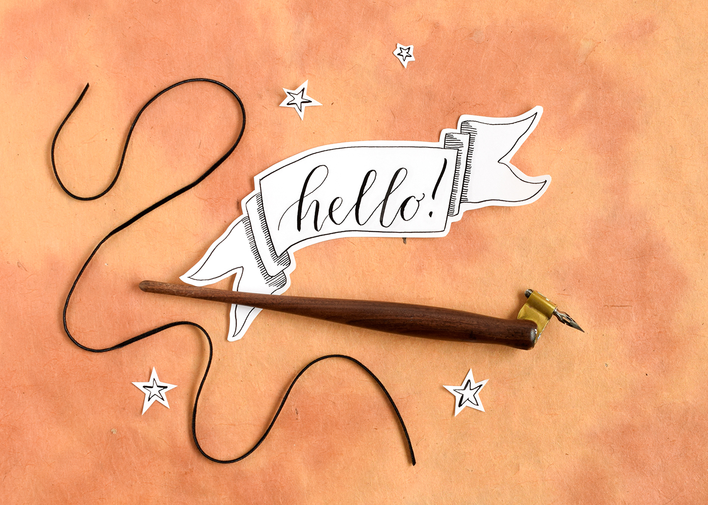
It’s nice to know how to draw a banner because banners make lettering stand out. If you have a particular message you want to get across, writing it in a banner will send a visual message of, “Hey, look here!” Unfortunately, banners can seem daunting to illustrate because the end product looks a bit complicated with its folds, shadows, and centered text. That, my friend, is precisely why I am writing this blog post: I promise you that, once you break it down, banners aren’t so tough! Today, we’re going to look at how to make the perfect banner to feature your lettering or calligraphy.
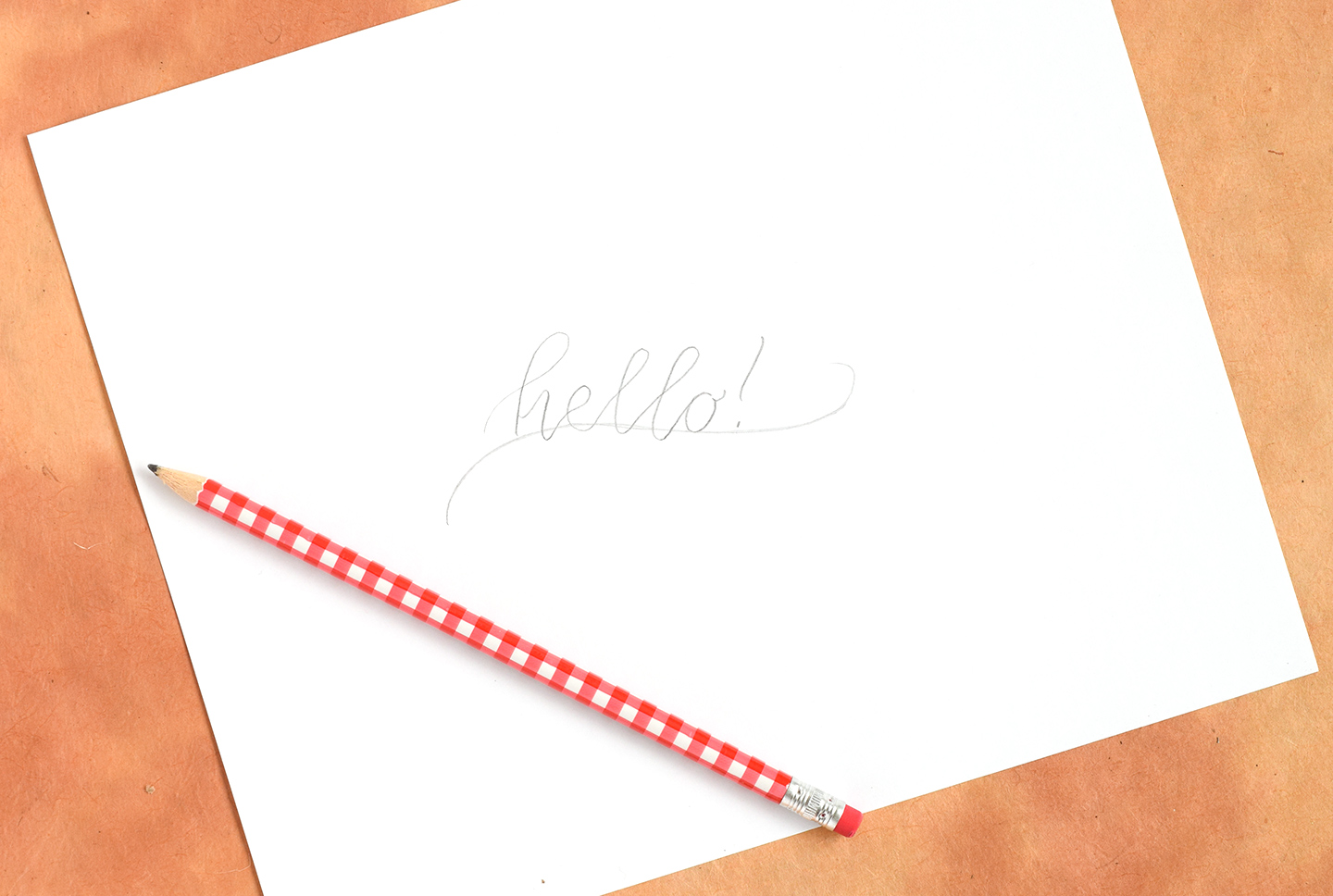
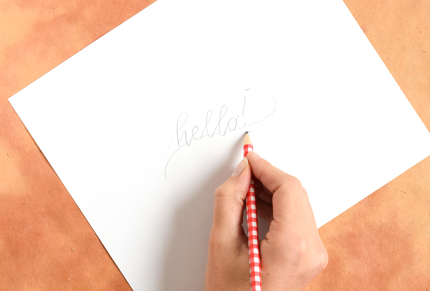
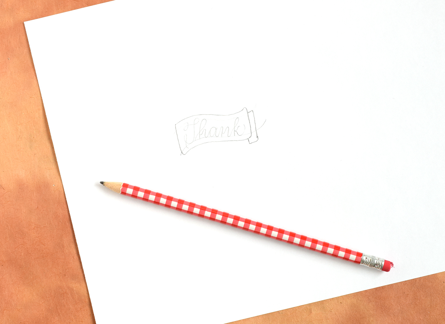
Your most valuable tool in this undertaking is going to be a pencil; I find it helpful to draw everything out in pencil first! Start by drawing a wavy line like the one shown in the photo below:

Next, use that wavy line as a base guideline to write a word or phrase in calligraphy. I am using Kaitlin Style calligraphy in the photo below.

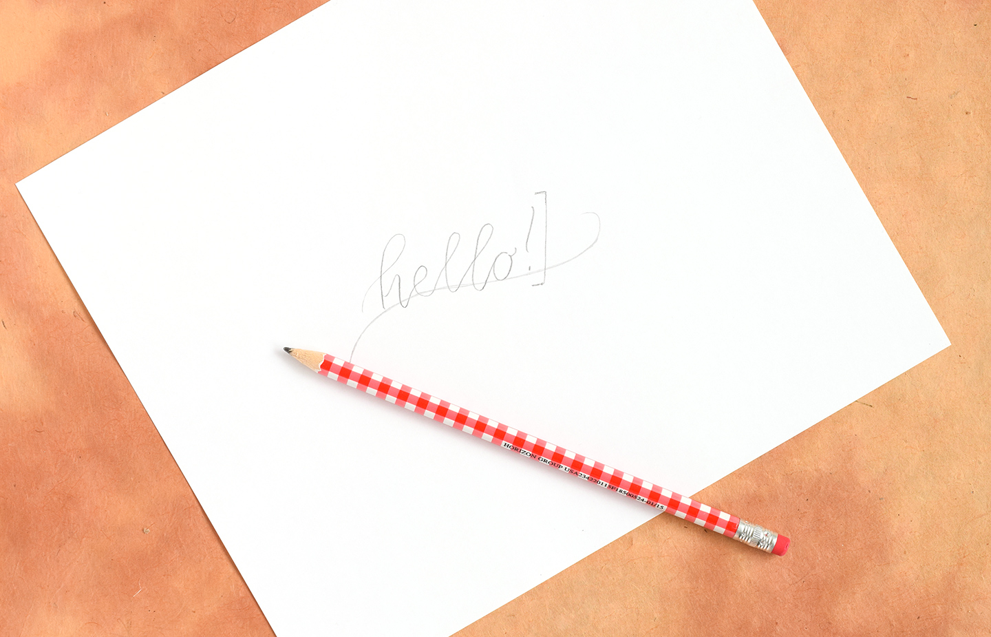
Once you have finished writing your calligraphy, draw a small horizontal line about 5 mm under the wavy guideline, and 5 mm above the tallest letter or symbol in your calligraphy. (For me, the exclamation point [!] extends the highest.)

Join the bottom little horizontal line with the top horizontal line using a vertical line that follows the contours of your last letter or symbol. You can see in the photo below that my exclamation point and the vertical line to the right of it are roughly parallel.

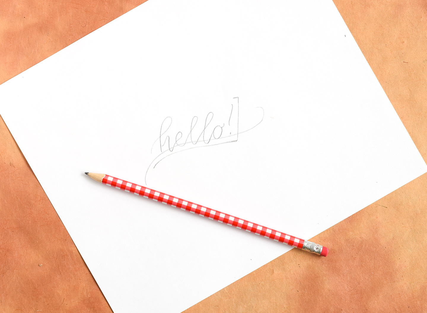
Next, freehand draw a line that extends left from the little horizontal line you drew at the bottom. Make sure this new line stays parallel to the wavy line you wrote your calligraphy on!

You’ll do the same thing for the top line. Try to make sure it stays parallel to the wavy line the calligraphy is on as well.

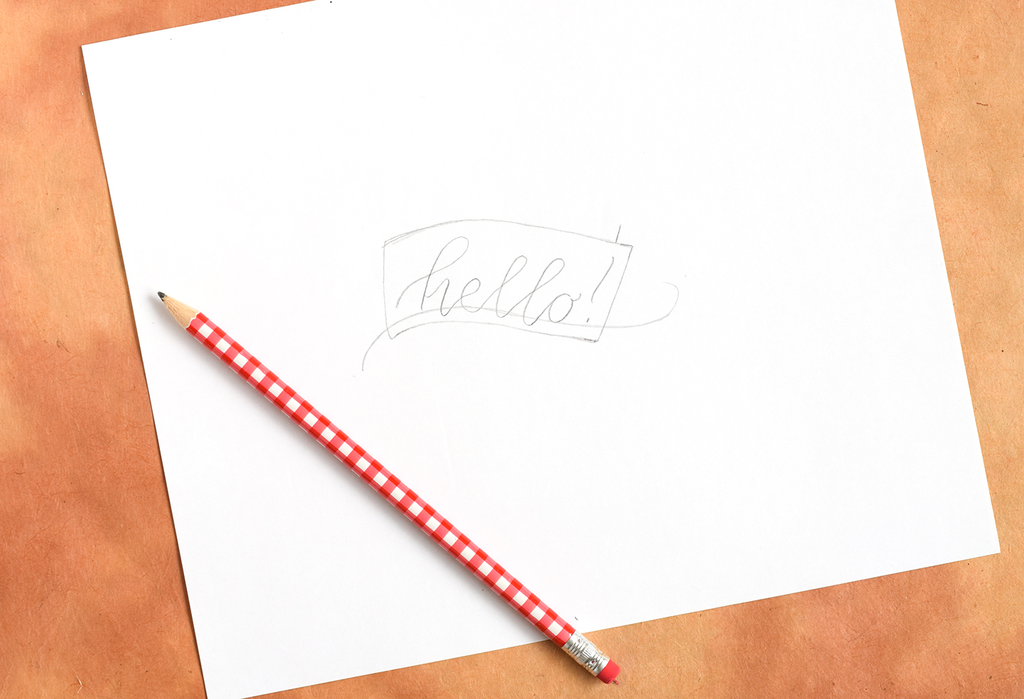
At this point, you’ll join the two long lines you just drew together with a vertical line on the left. I like to angle that new vertical line such that it leans the opposite direction of the right vertical line. For example, if you look at the picture below, you’ll notice that the vertical line on the right slightly angles to the right, and the vertical line on the left slightly angles to the left.

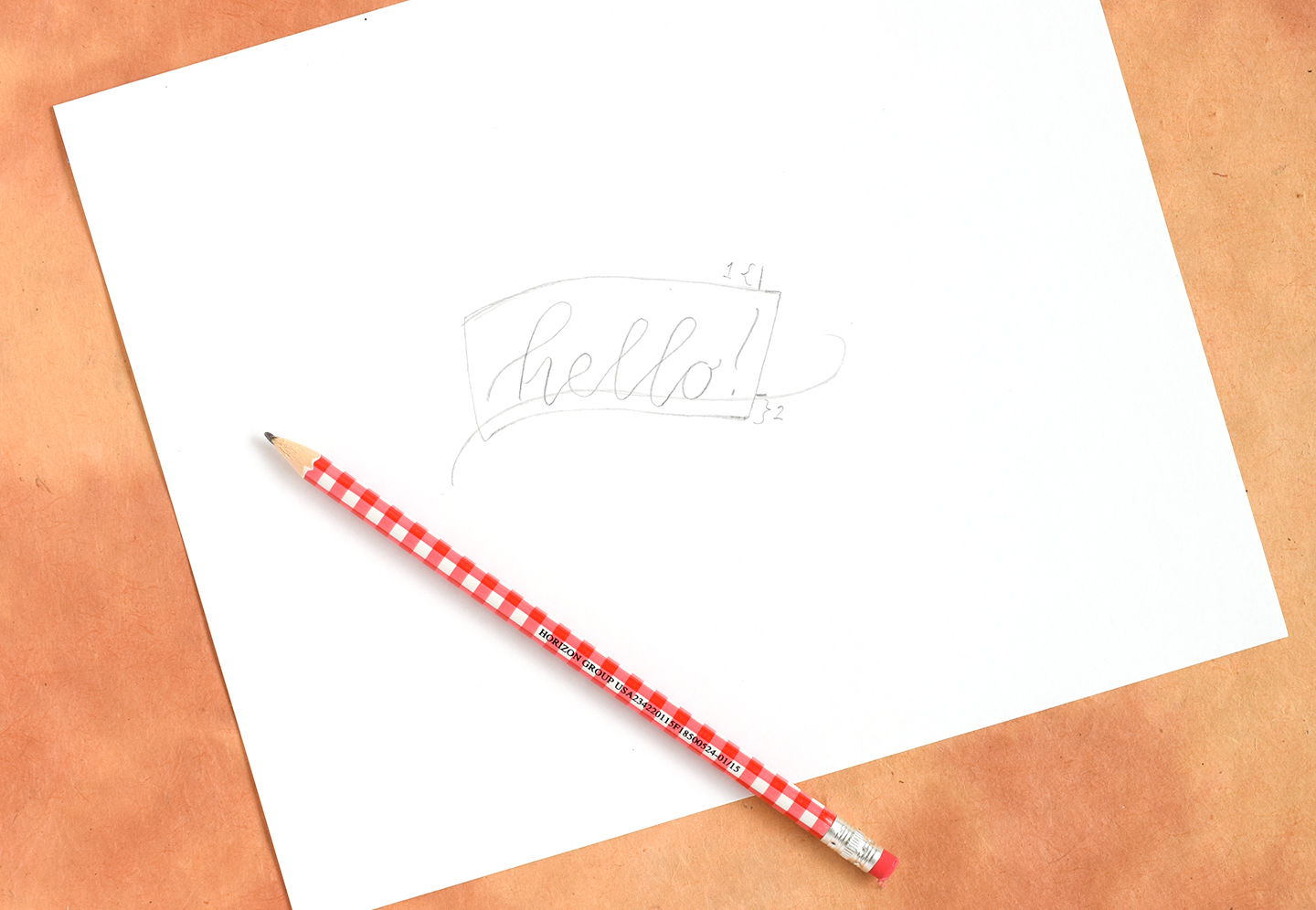
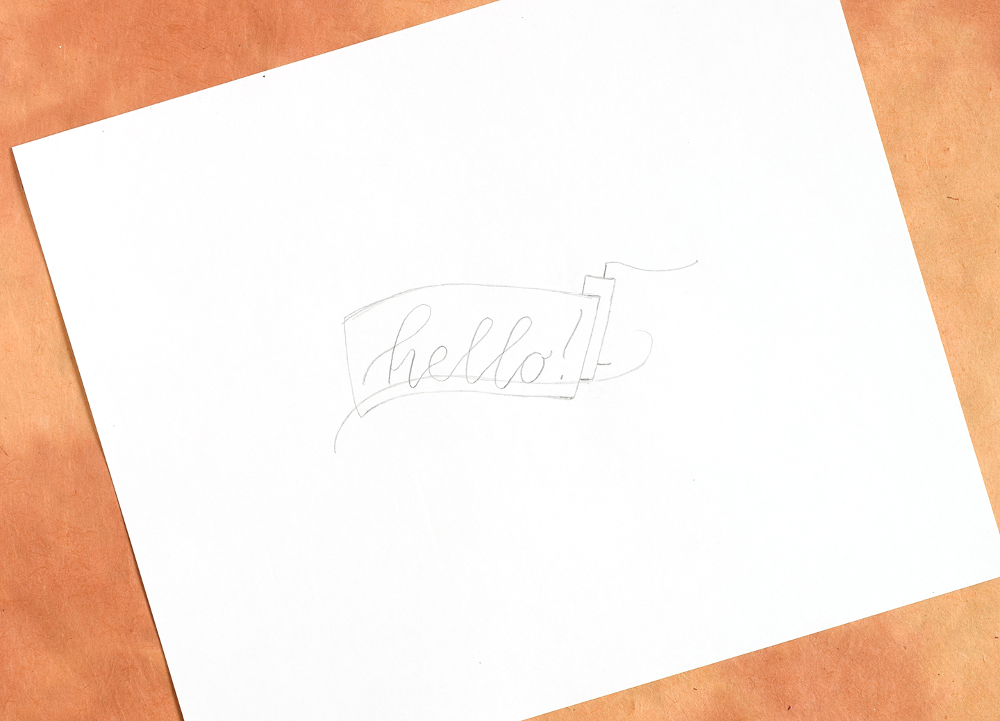
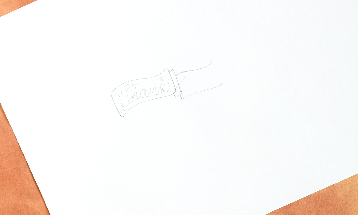
At this point, it’s time to draw in the tails of the banner. Start by making a little line (4 mm tall or so) that extends upward from the right corner area of the banner. Notice that the little line in the photo below is about 4-5 mm from the right edge of the banner; that’s where you’ll want to draw your line, as well.

Next, draw a little (about 3 mm long) horizontal line that extends out from the right edge of the banner, near the bottom. In the photo below, I have labeled the first line I drew as “1”, and this new little horizontal line I’m referring to as “2”. The reason I have done that is I want to explain to you that the distance between the bottom of the banner and line 2 should measure the same amount of distance that the top of line 1 measures to the top of the banner. If you’re confused by this step, be sure and watch the video at the end of this post — it’s easier to explain if I can show you!

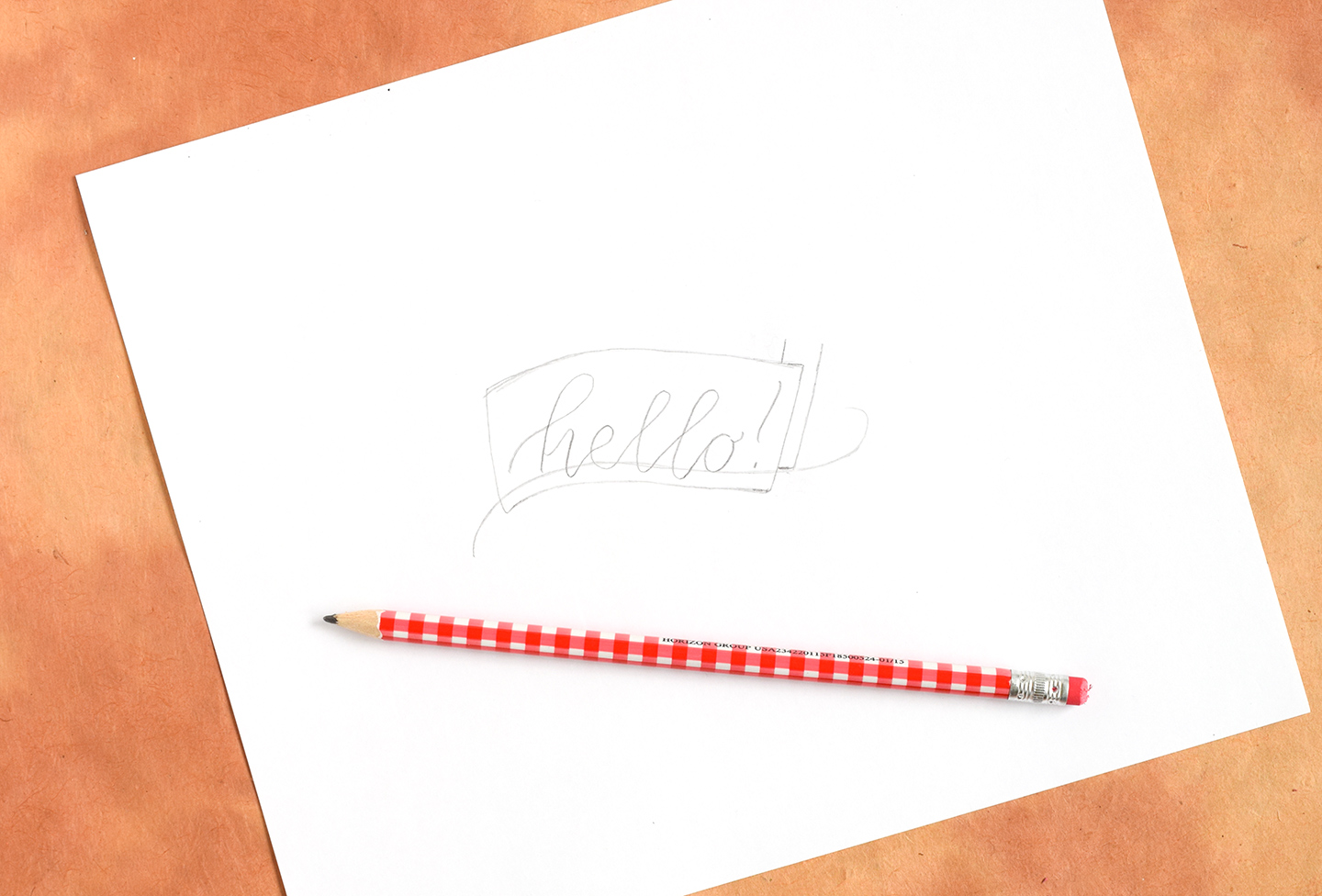
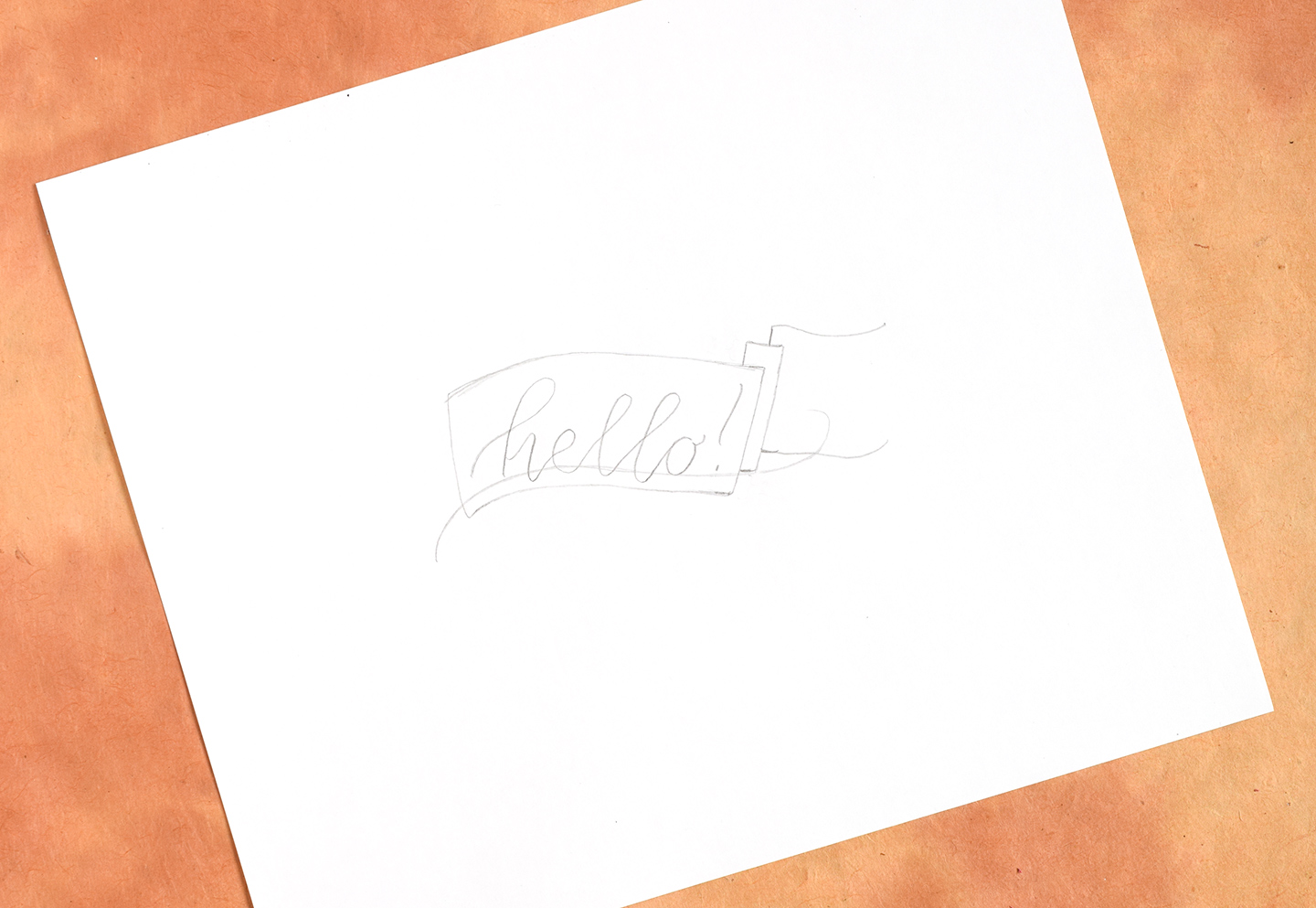
At this point, you’ll want to draw a vertical line that extends up from the right side of the little horizontal line you just drew. Make sure this new line is parallel to the right edge of the banner, and that it extends as far up as the little vertical line near the right corner of the banner.

Now, use a horizontal line to connect the little vertical line in the right corner area with the long vertical line you just drew! This action will create a small, skinny rectangle that appears to be behind the shape containing the “hello!” calligraphy.

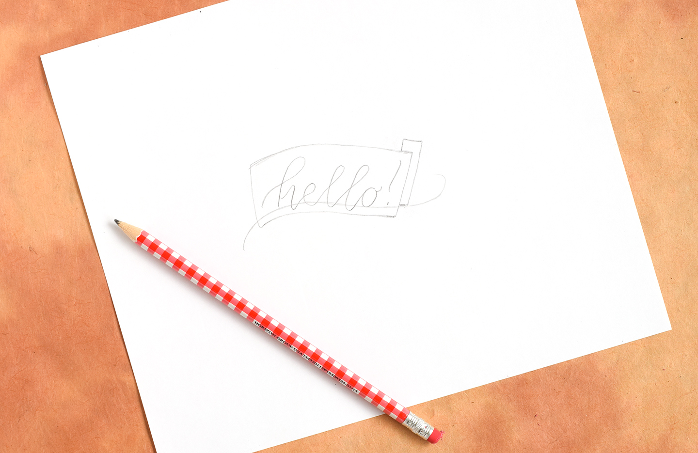
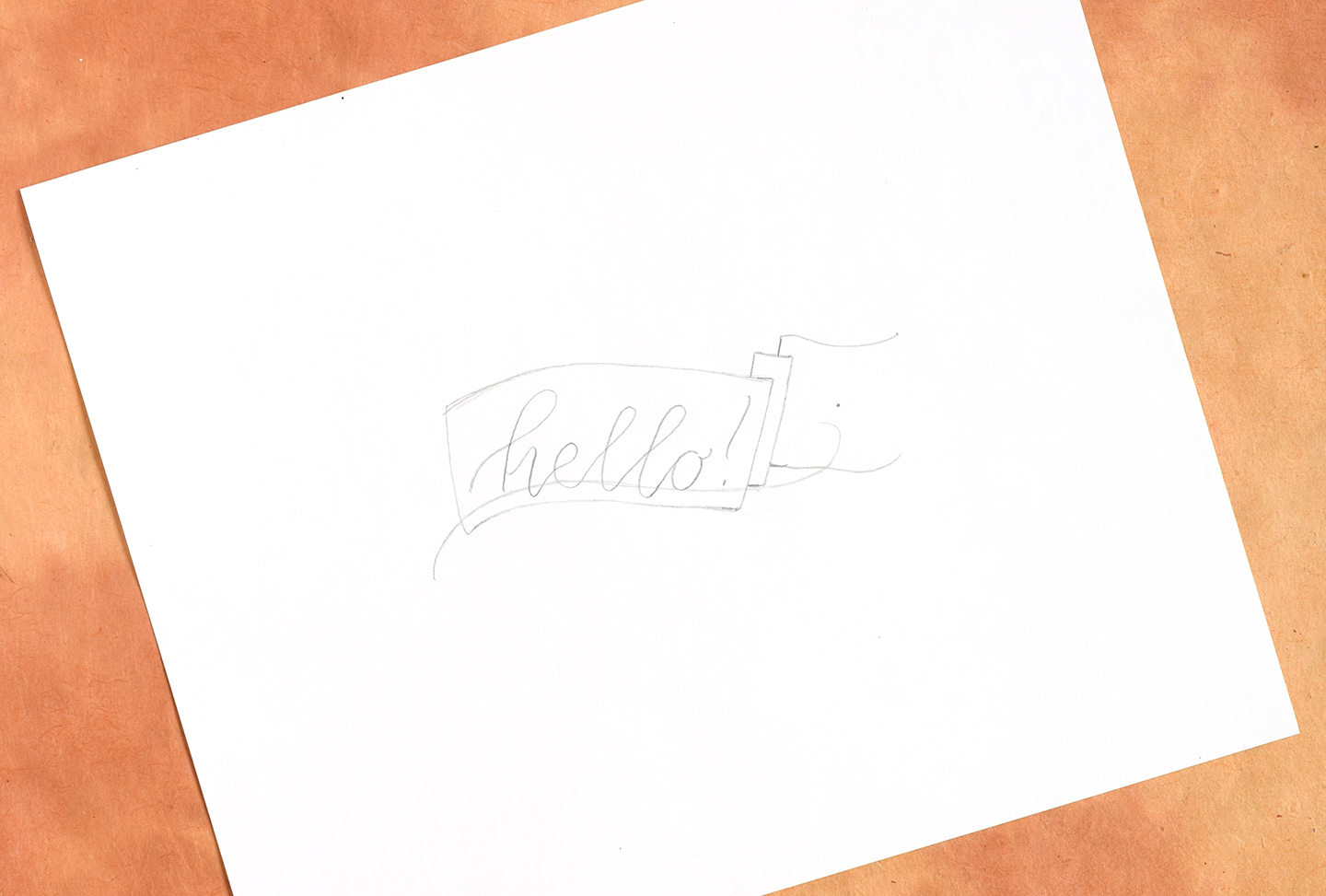
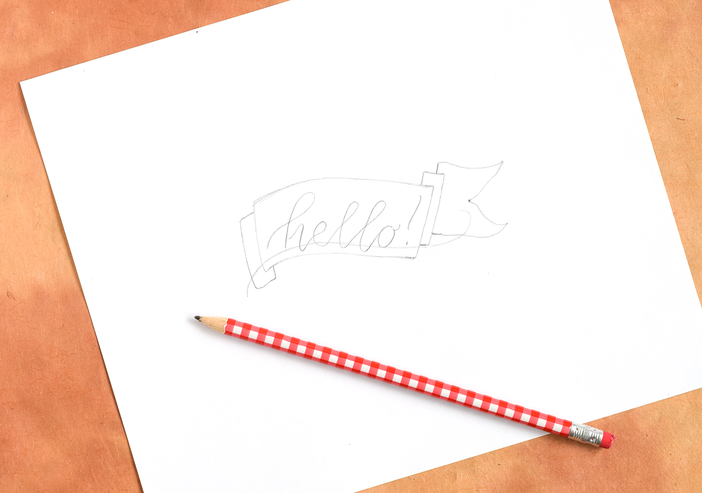
Repeat the process by drawing a vertical line coming out of the top middle of the rectangle you just drew. Make sure you also draw a horizontal line coming out of the bottom right, as pictured below.

Now, draw a curvy horizontal line extending to the right from the small vertical line at the top.

Then, draw an extension out from the little horizontal line you drew near the bottom. Try to keep it parallel to the line you just drew in the step above!

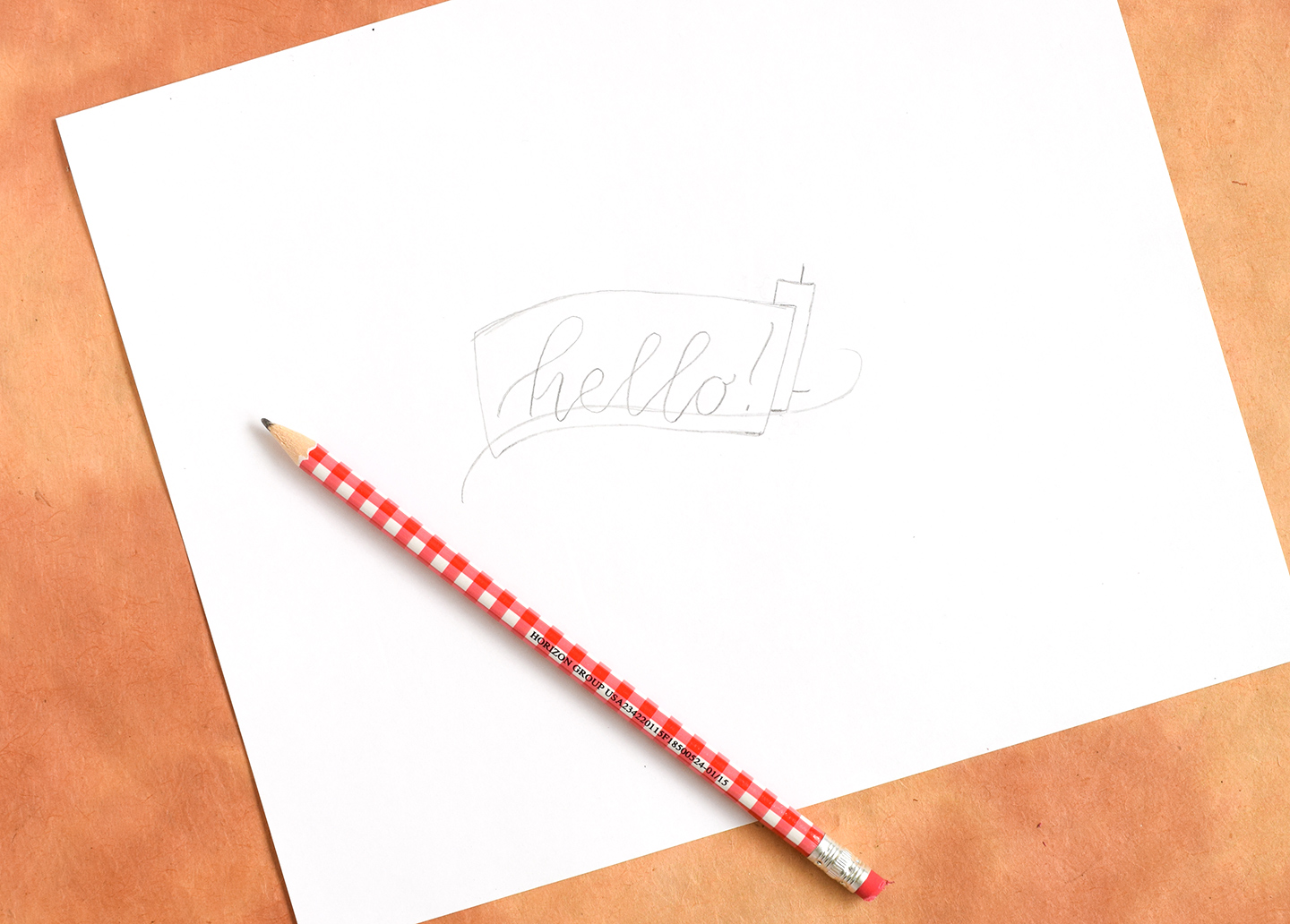
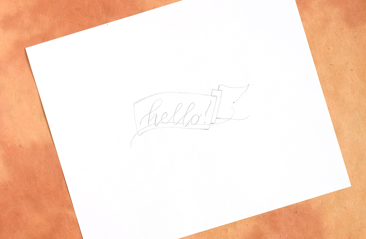
Imagine that there’s a vertical line connecting the ends of both of the horizontal lines you just drew. If there were a line there, the shape would be a curvy square. Think about where the middle of that theoretical curvy square would be, and draw a dot there.

Connect the right side of the top line to that dot as shown in the photo below …

… And follow suit with the right side of the bottom line as well.

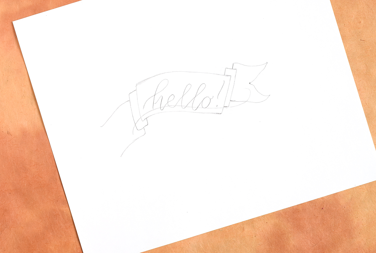
Now the right side of your banner is finished! At this point, you are going to repeat all the steps you did on the right side of the banner, but do them on the left side, and have all of your elements extending down instead of up. Again, if this is a confusing concept, the video at the end of this blog post will prove immensely helpful!


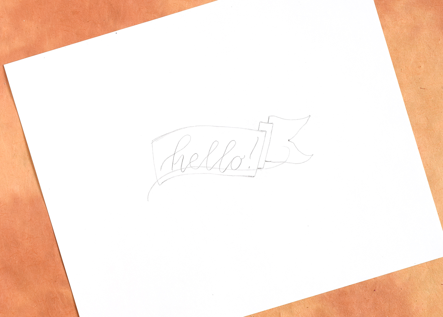
Once your banner looks like this, you’re ready to go over it with ink! I always start by going over the lettering/calligraphy first, but that’s a personal preference.

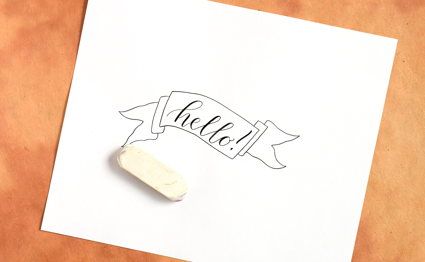
Then, go over the rest of your banner with ink as well.

Once the ink is dry, erase your pencil guidelines.

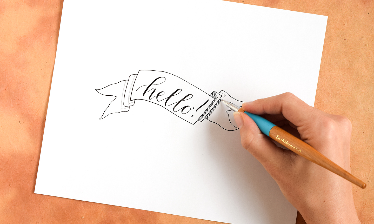
For the step I’m going to show you below, it’s not necessary for you to draw pencil guidelines. However, I have drawn them to show you what I’m doing! Basically, I’m scouting out where the shadows need to appear on this banner. Any element that is behind another element will need a shadow. You know that the shape that contains the “hello!” calligraphy is front and center, so it won’t have any shadows on it. However, the components of the banner’s tails will be shaded in some way. The video at the end of this post offers a better explanation of this, but below you can see that I’ve identified in pencil where my shadows should appear.

Take your dip pen and draw several tiny lines; the lines should all extend to the same edge until they reach an area that is not bordered by another shape, at which point they’ll start to taper off. In the photo below, for example, you can see that the shadow lines that are connected to the shape containing “hello!” all extend the same distance to the right. However, the part of the rectangle that is not connected to that “hello” shape — the top part — has lines that taper to the left. This visually indicates that there is less of a shadow in that area.

Continue to draw shadows until your banner looks like the one below, and you’re finished!

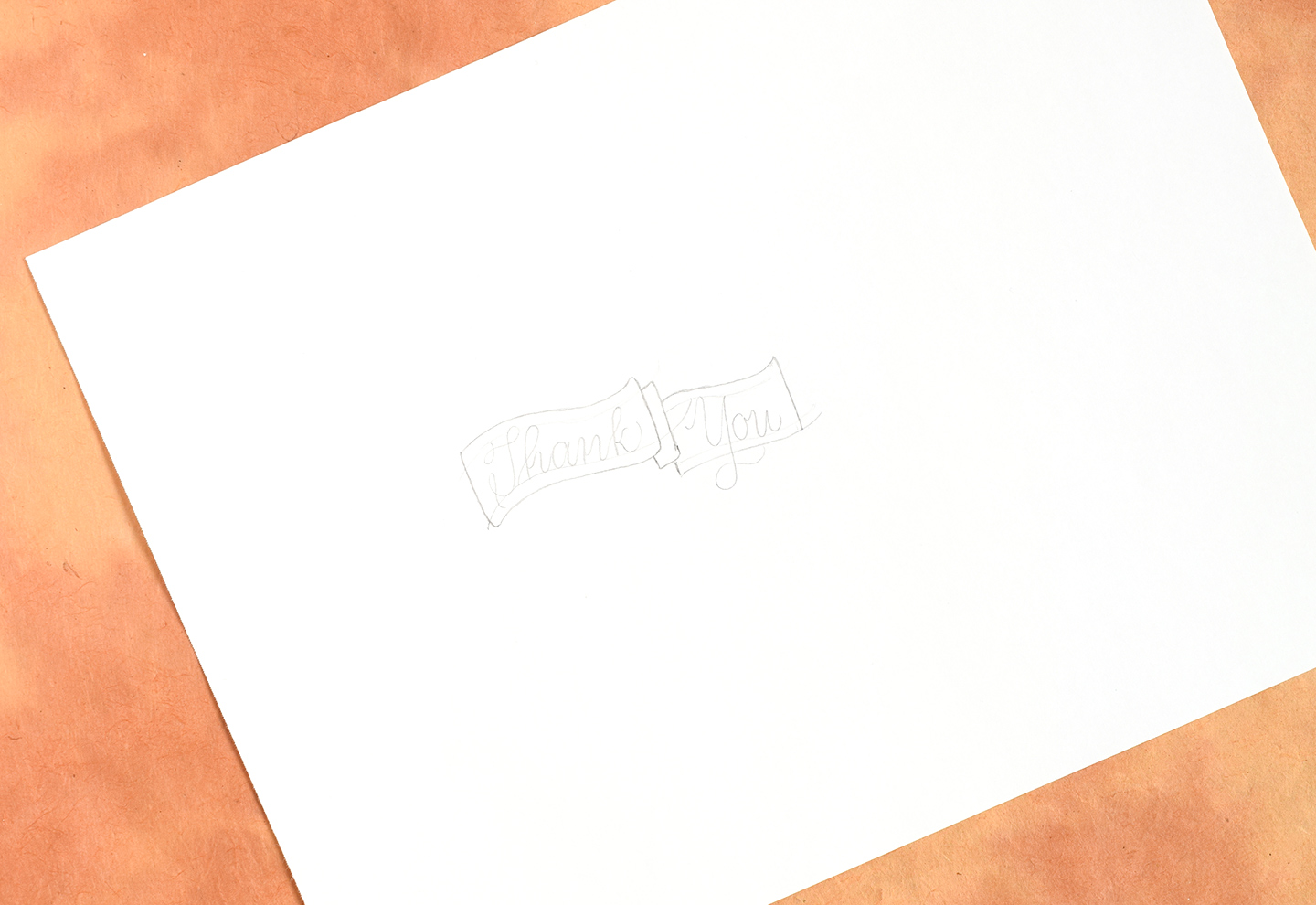
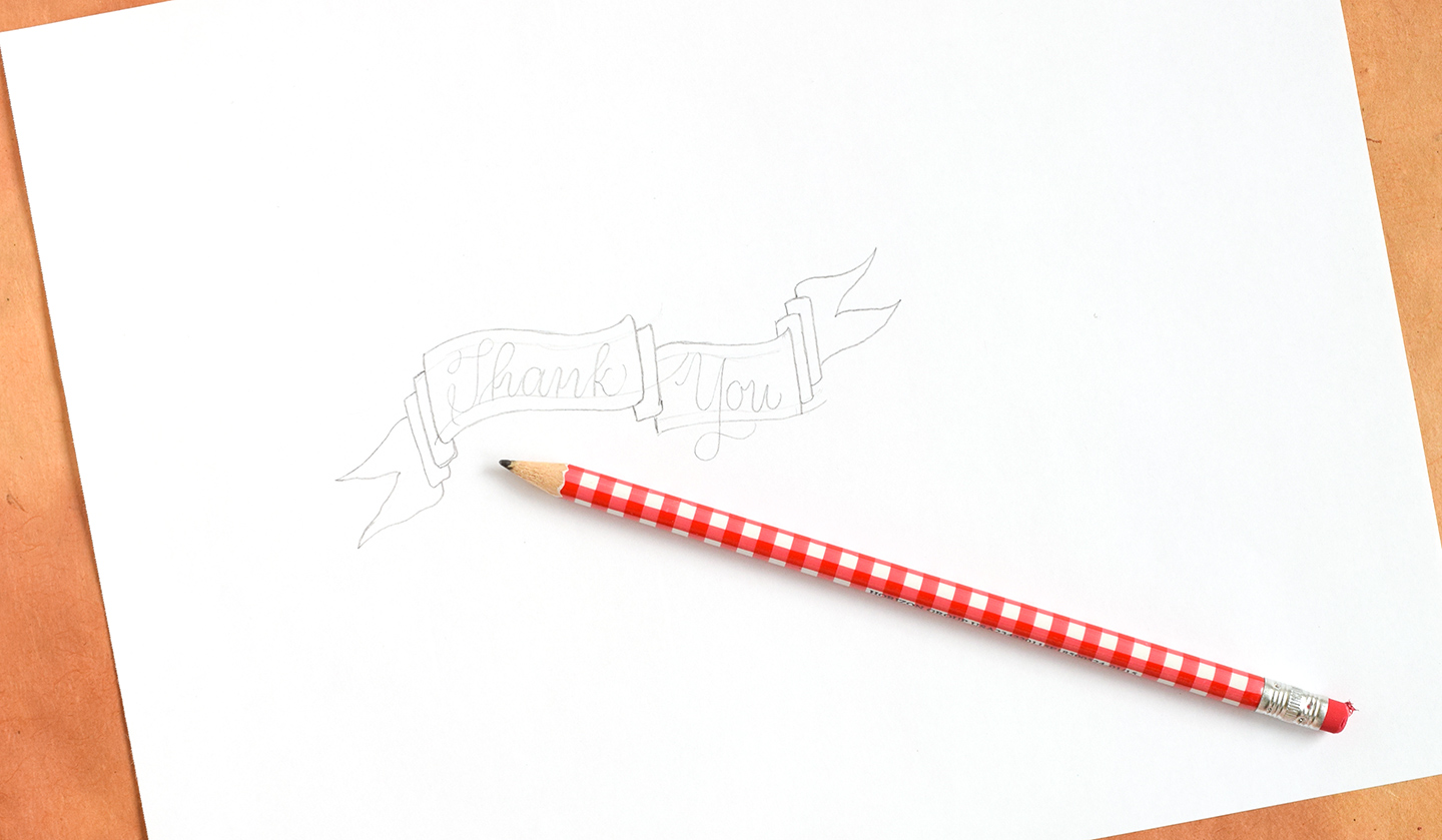
You may be thinking, “Okay, that’s all good and well — but how do I draw a banner with more than one featured word, like ‘Thank’ and ‘You’?” I’ll show you! You’ll start off just like you did with the banner above, making sure to calligraph your first word and draw around it. Then, go ahead and draw a skinny rectangle on the right. That rectangle should extend below the shape that has the calligraphy/lettering in it.

Next, draw a small vertical line extending down from the middle of the skinny rectangle you just drew, then draw a long horizontal line coming from the small vertical line. Draw another horizontal line on top, making sure the horizontal lines maintain a distance apart that is roughly the same distance between the horizontal lines in the shape containing “Thank”.

Write your second word between the two horizontal lines you just drew. If you have a letter that dips down (e.g. “Y”), feel free to let the tail go below the bottom horizontal line! Once you have written your word, “close” the shape by adding a vertical line on the right.

Next, add tails to both sides of your banner.

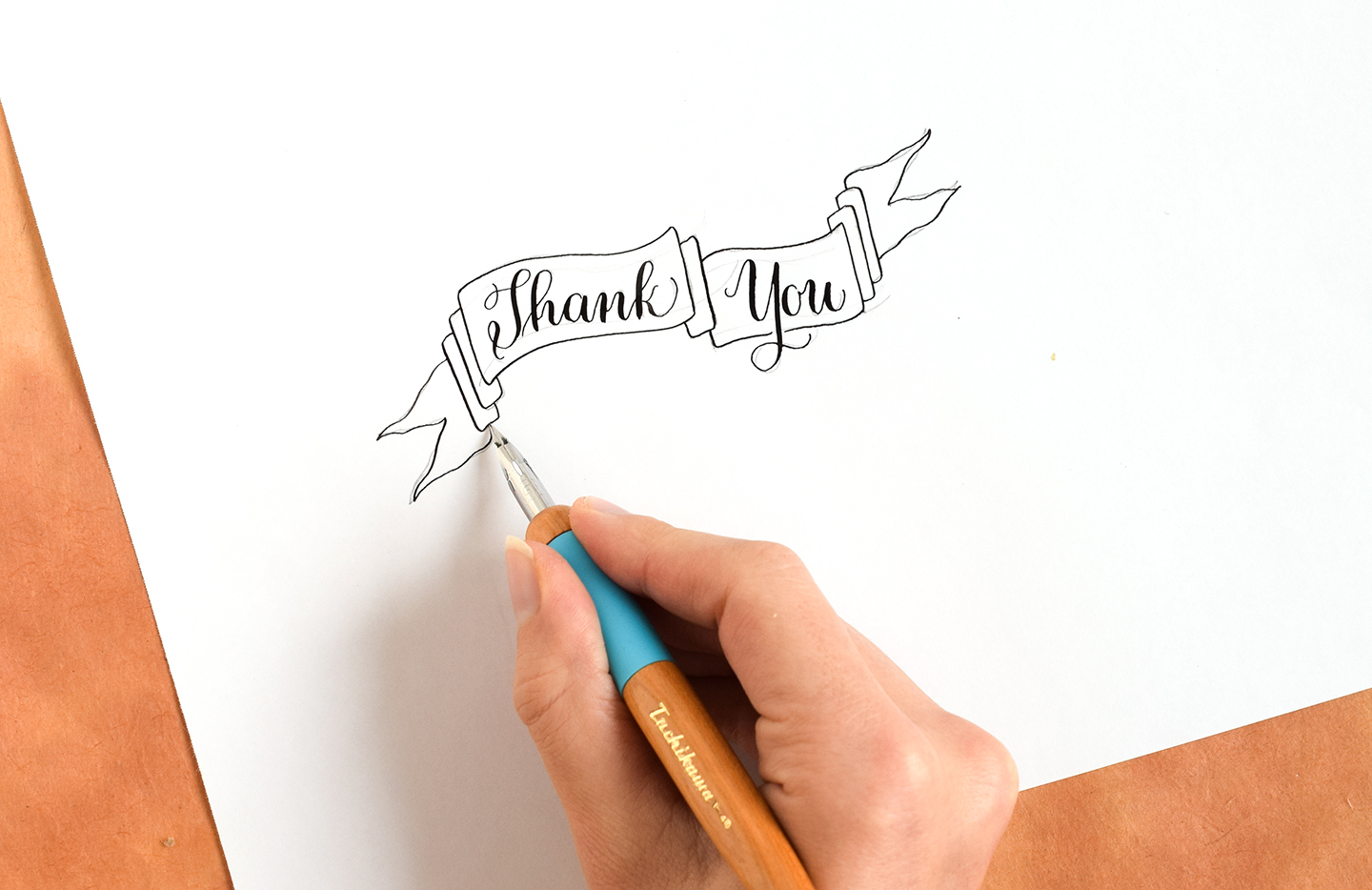
Once your pencil sketch is finished, draw over it with ink!

The banner below features Amy Style calligraphy, which lends a nice, clean look to the piece as a whole.

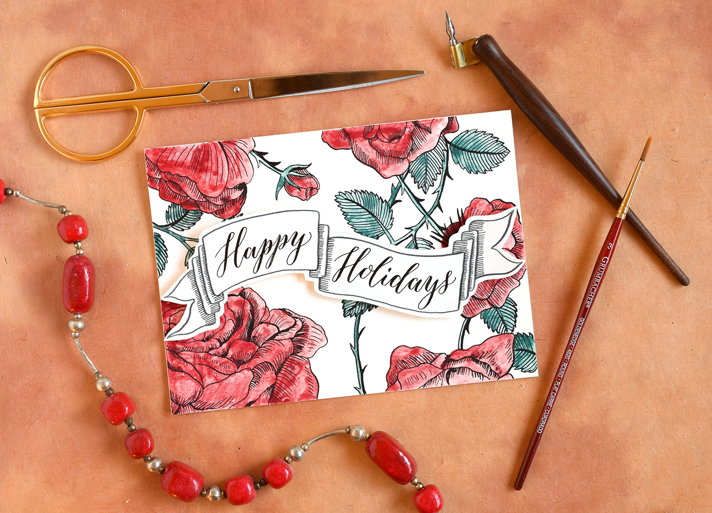
You can use these banners on a number of projects, including holiday cards:

Envelope art:

And general photo announcements destined for social media:

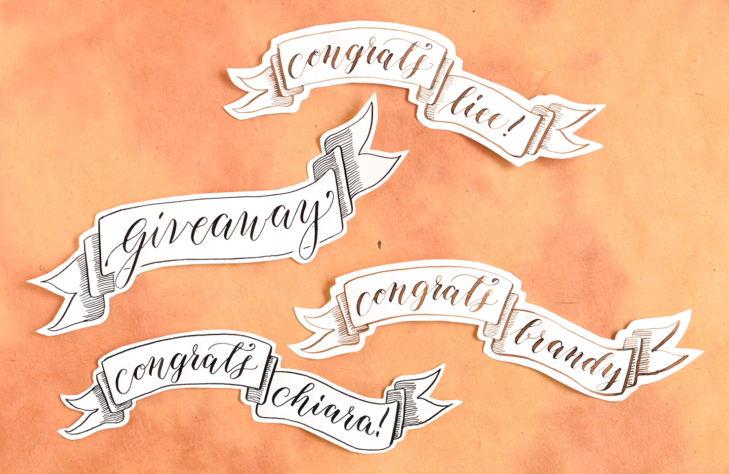
I love drawing banners, and I use them for many applications — including announcing the winners of TPK weekend giveaways on Facebook and Instagram! Banners provide a quick, artistic way of conveying a message.

Next time you want to make your calligraphy stand out, give this tutorial a try and draw a banner! I promise you can do it. The video below will help you to understand the process even better:
[vimeo 148157310]
I hope that the technique outlined in today’s post comes in handy! If you liked this tutorial, you might also enjoy the Hand-Drawn Banner Tutorial; it’s an older tutorial here on the TPK blog, but will prove inspirational if you like illustrated banners. (By the way, If you’re ever feeling lazy [I know I can’t be the only one], then you can always just print off this banner template instead of taking the time to draw!)
Thanks very, very much for reading! I am always appreciative of your presence here. 🙂
Warmly,
