No matter how amazing your calligraphy skills are, it can prove challenging to space calligraphy on envelopes. Really — if you’ve ever had a problem writing the perfect address, you’re not alone. It took me a long time to figure out how to properly space calligraphy; and, to this day, I can’t boast a 100% success rate. Still, though, I’ve developed some tips and tricks that make it easier, and I’d like to share them with you in this post!
1. Use a Guidelines Template
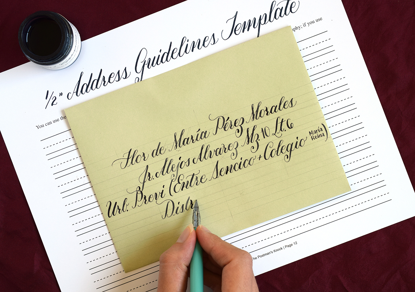
Life is so much easier when you use a guidelines template to space calligraphy, and templates are easy to DIY! The “Beautiful Beth Style Envelopes” template shown below was created using Photoshop, but you can absolutely make a template by hand. All you need to do is take a piece of printer paper and draw evenly spaced lines on it, preferably in groups of three. The top line serves as a height guide for capital letters, the middle line guides you for lowercase letter height, and the bottom line is the base line. You can make several lines like the template below, which works for any size of envelope and allows you to customize the number of address lines that you draw …

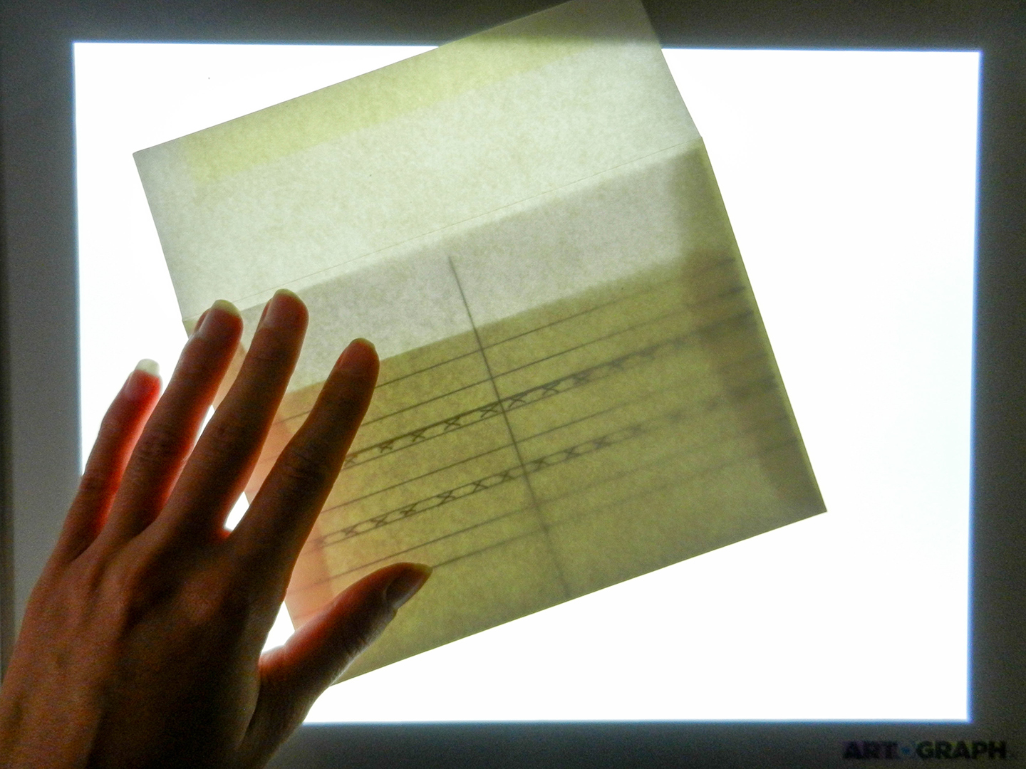
If your envelope is light-colored, you can shine a cut-to-size template up through a light box. That will save you the trouble of having to erase pencil lines later!

The time you invest in making a template will save you a lot of measuring and hassle in the future. Make one now, and you can use it to space calligraphy for years to come! As far as the actual distance between lines, that’s personal preference. I generally make my guidelines 1/2″ tall (measurement from bottom guideline to top guideline), and I allow a little over 1/8″ of space between groups of guidelines.
2. Consider the Calligraphy Justification
Once you draw guidelines, it’s time to consider whether you will justify your calligraphy to the left, center it, or justify it to the right. Here’s some information to help you decide:
Left Justification
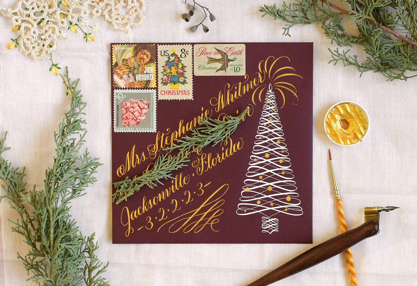
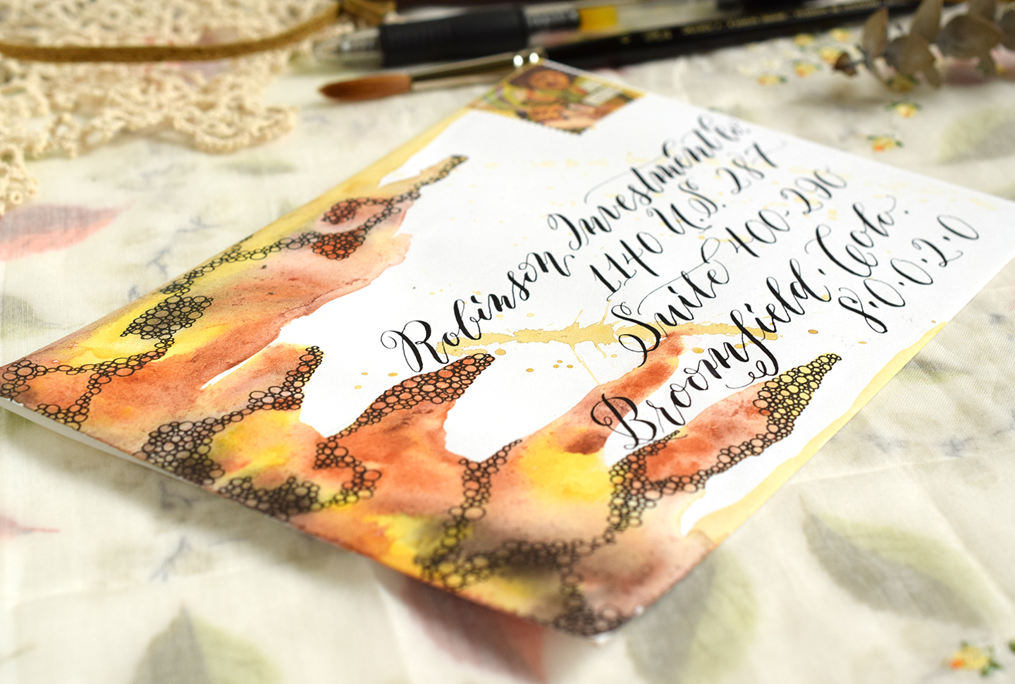
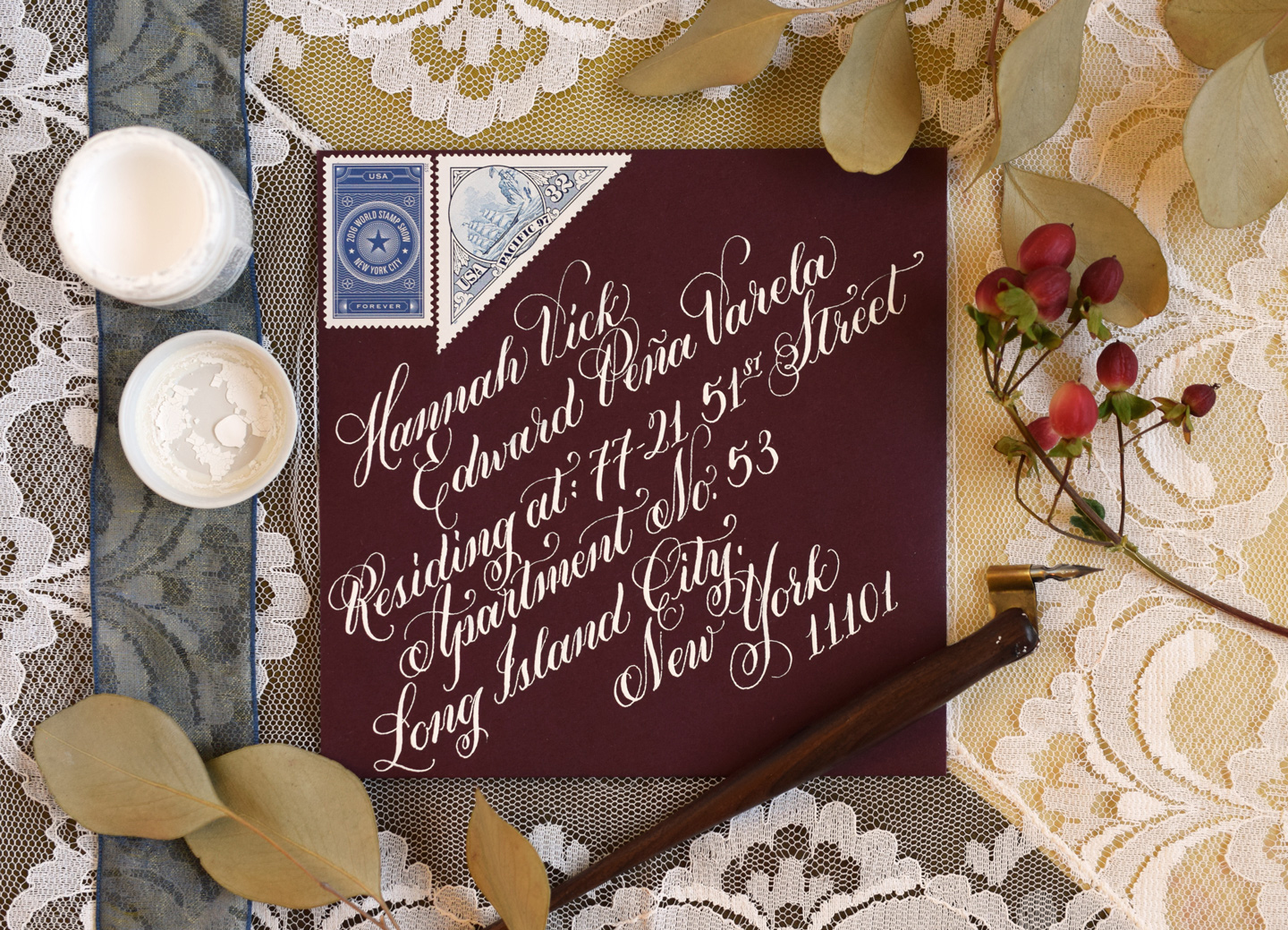
I prefer to use left justification because it is not terribly time-consuming. You always know for sure where to start writing each address line, and it doesn’t matter where the line ends. Left justification looks especially cool when it’s diagonal, as shown on the holiday envelope pictured below:

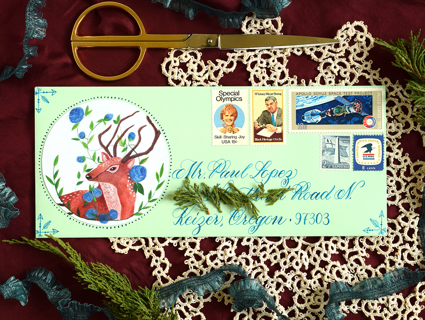
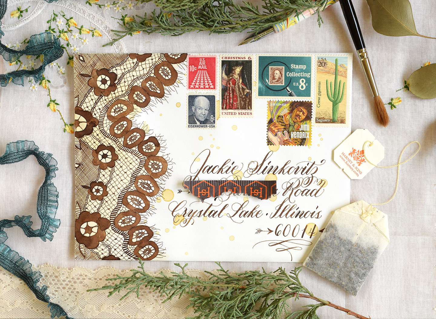
Left justification also is fetching when written horizontally. You can use it in combination with a graphic like the Janet Style mail art below, or keep it more formal. I recently saw a photo of left-justified Kaitlin Style calligraphy envelopes on Instagram that were fit for a black tie event!

Center Justification
Center justification is the gold standard of wedding envelope calligraphy. If you ever find yourself addressing envelopes for an event, this is probably the justification that your client will want. I think it’s so appealing because it caters to the human love of symmetry … centered calligraphy looks neat and elegant.

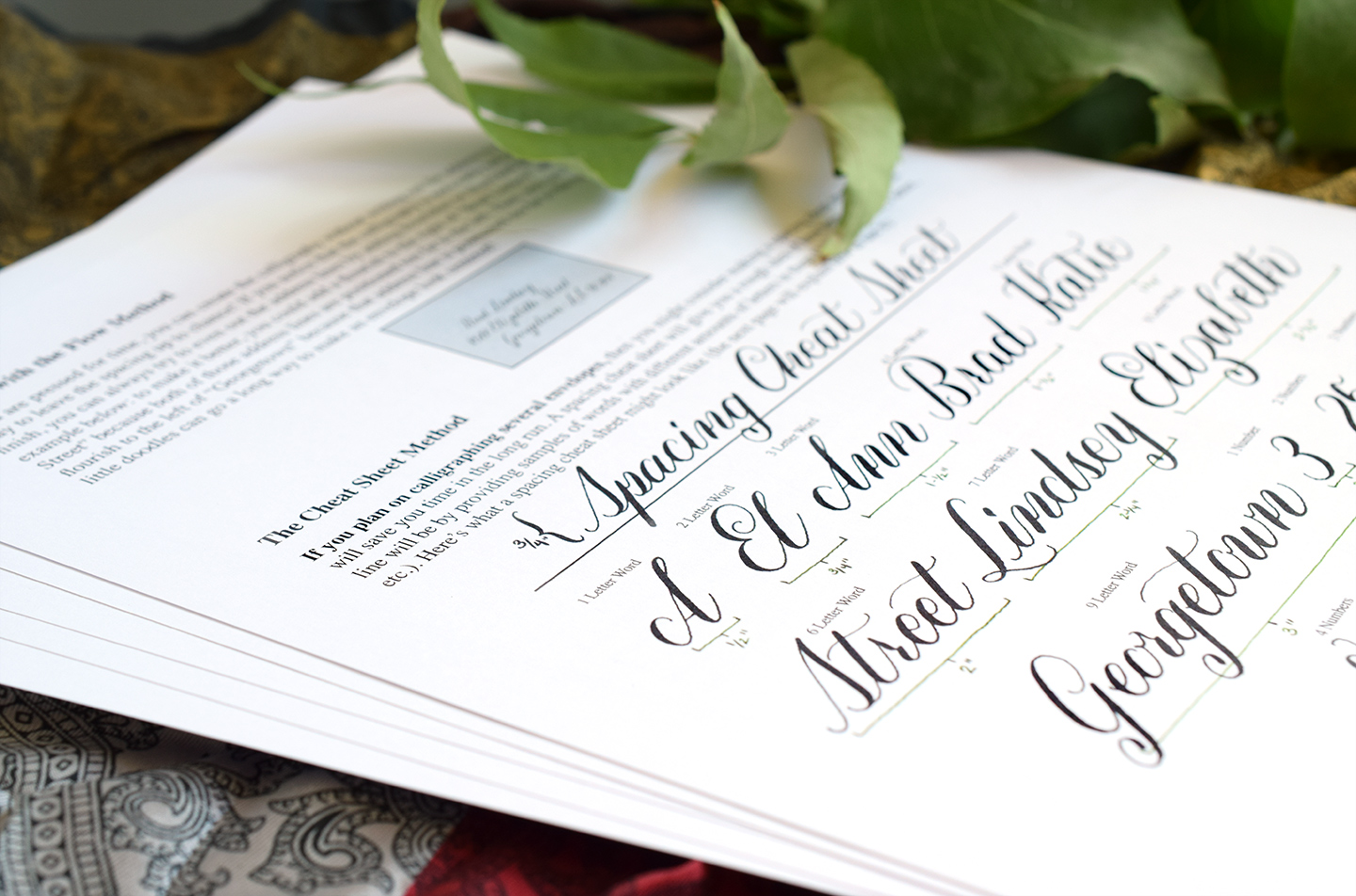
There’s a disadvantage to this type of calligraphy, and that’s the fact that it takes some math and measuring. There are different ways to approach centering calligraphy. Some people use their computer’s word processor to figure out spacing (as described in the Envelope Calligraphy Spacing Tips and Techniques post). I, however, prefer to use a “spacing cheat sheet”. A spacing cheat sheet, explained in detail in Beautiful Beth Style Envelopes, is basically a sheet where you write several words and measure them. The first word should have 1 letter, the next 2, and the next 3, etc. You can use this cheat sheet to estimate the length of an address line based on the number of letters in words.

Once you estimate the length of the address line, you can draw faint pencil guidelines on the envelope based on that measurement. It’s a little bit of a pain, yes, but it does result in beautifully centered envelopes!
Right Justification
I find right justification to be the most difficult kind of justification to create. If your spacing is off, it’s going to be easy to notice. That said, you can use the same measurement estimation techniques for right justification that I described for center justification.

I generally use right justification when I have a graphic taking up space on the left. Otherwise, the envelope tends to look unbalanced because everything is on the right (calligraphy and stamps).

No matter which type of justification you choose, there are pros and cons. You just have to consider what fits your vision and your timeline!
3. Be Flexible with Intersecting Letters from Different Lines
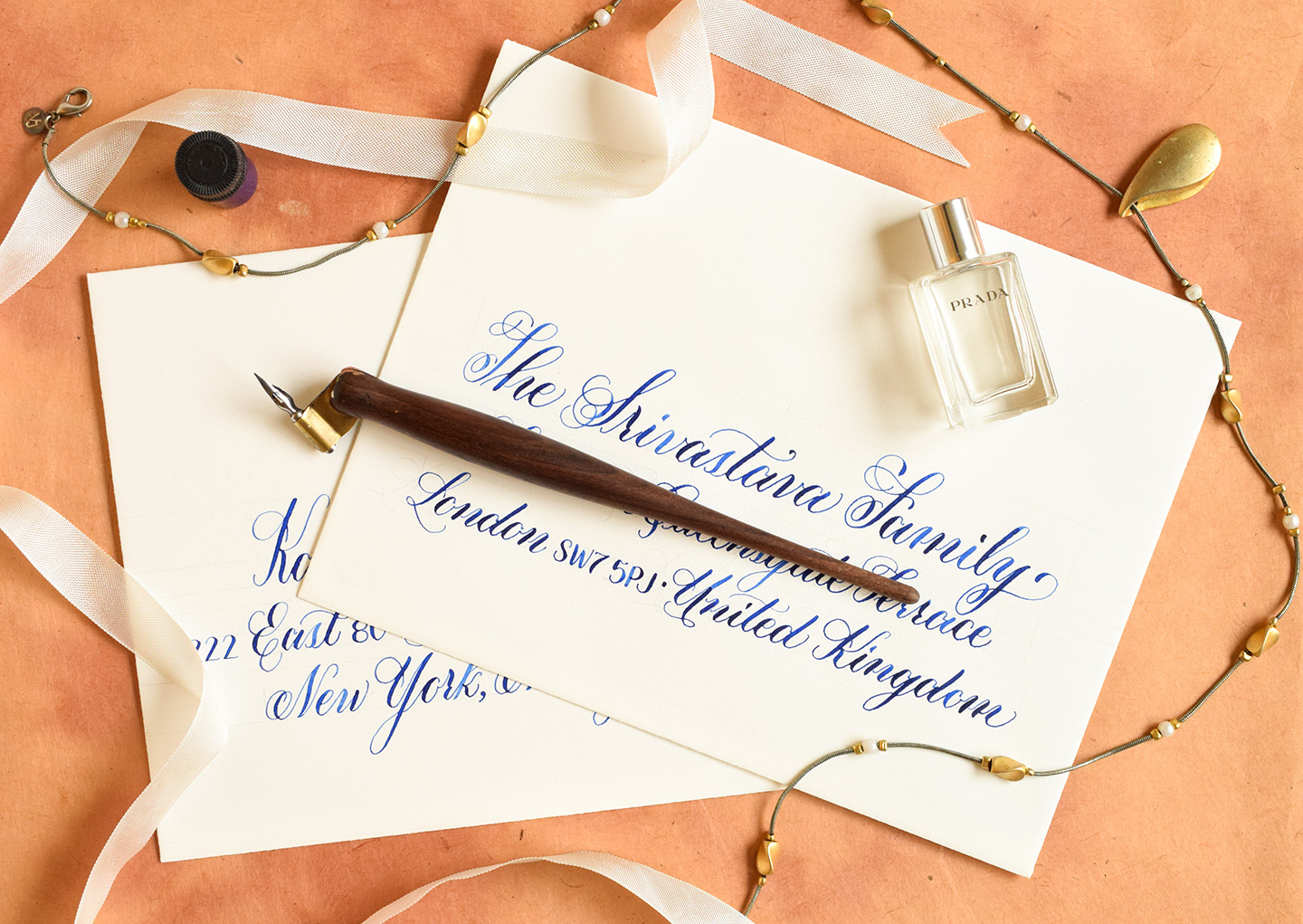
A lot of calligraphers get concerned about different lines of calligraphy intersecting. As long as the address is readable, though, it’s really nothing to worry about. You can see in the Janet Style address below that the “y” of “Barry” is partially covered by the “L” of “Ln.” As long as it looks good to you and the mail person will be able to decipher it, it’s not a big deal.

If you are concerned about lines intersecting, you can always “cut off” parts of letters. For example, in the address below, the “E” of “Edward” doesn’t have a top, and the “N” and “Y” in “New York” also have parts missing to accommodate other letters.

4. Add Embellishments to Balance the Calligraphy
You can see in the envelope below that 3/4 of the address lines feature letters with tails like “g”, “z”, and “y”. The address line with “Vine St.”, however, does not have any letters with tails. Effectively, the address line seemed to be out of place, and the calligraphy spacing looked “off”. If you run into a situation like this, find a way to add a downward-reaching embellishment to a letter in the affected address line. (The new Flourish Formal worksheet features several embellished letter suggestions!) In this case, I added downward-reaching swirls to the “S” of “Street”. The “S” swirls balance the third line out and make the envelope look cohesive.

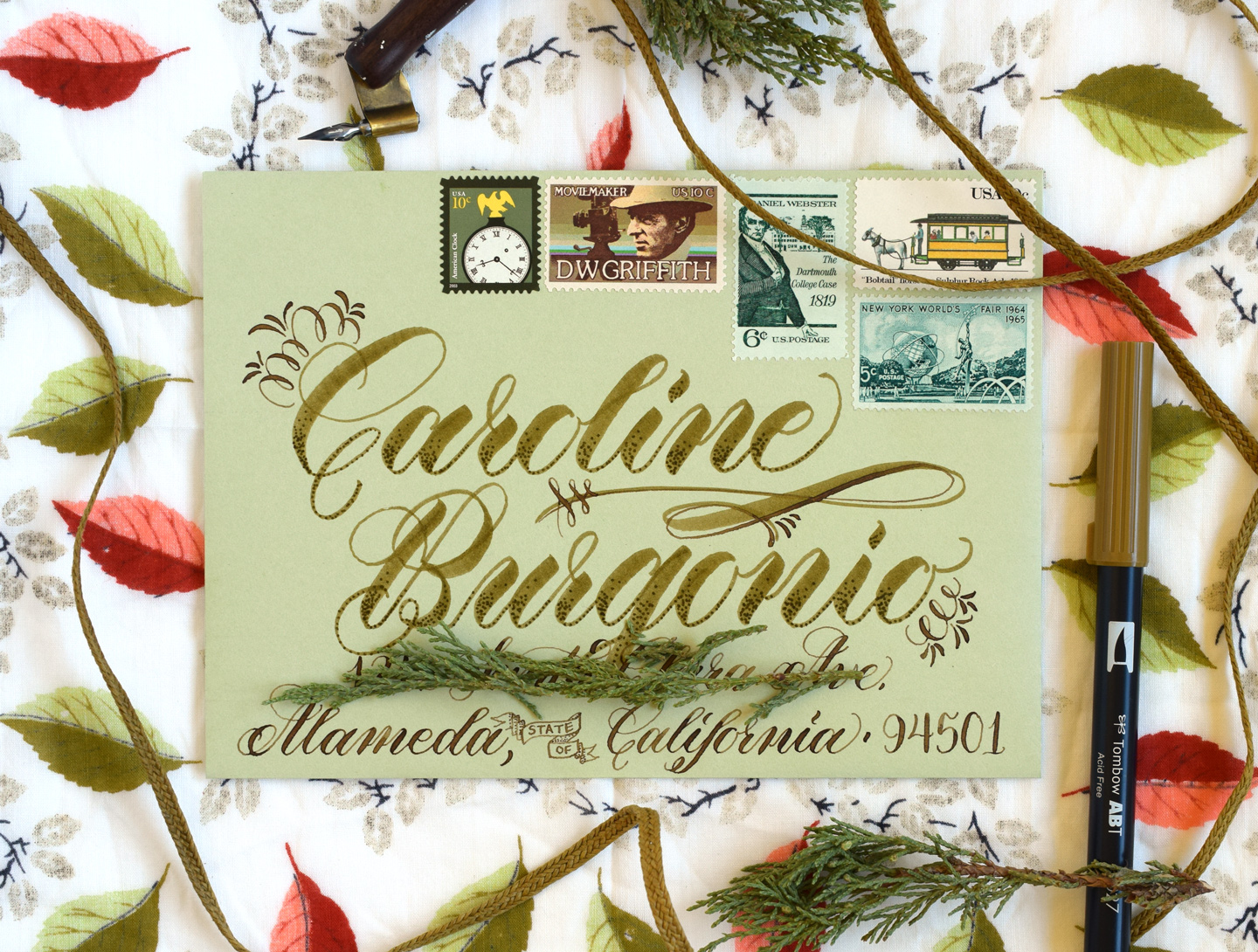
Similarly, if you discover that your centering is off, you can add graphic elements to lengthen it. In the envelope below, I realized that I had budgeted too much space for the city/state/zip. Effectively, I added a banner reading “STATE OF” to stretch the calligraphy. Worked like a charm!

The embellishments you use will vary based on your personal style and the project. However, you shouldn’t be afraid to use them to salvage a piece. You’ll find that a few of your “mess up” envelopes will end up being your favorites because of the creativity you had to exert to fix them!
Calligraphy spacing, unfortunately, will always be one of the more tedious aspects of the craft. It’s not very fun to estimate and measure out address line lengths, but making gorgeous envelopes is worth it! Just remember to have patience, be creative about solving problems, and don’t take spacing too seriously. If you wanted truly perfect spacing, you’d run your envelope through a printer: the whole appeal of calligraphy is its imperfection! Once you get the hang of addressing beautiful envelopes, you can always sell your services for some extra income.
I hope that this post helps you next time you sit down to address an envelope. Of course, if you have any questions or suggestions, please feel free to contribute in the comments! Otherwise, enjoy the rest of your day, and thanks so much for reading TPK!
Warmly,

*This post contains affiliate links to Amazon


