If you have ever written out a word or phrase in calligraphy and noticed that the lettering could use a little bit of embellishment, then you’ll enjoy today’s post! In it, you’ll learn three simple calligraphy flourishes to make your lettering pieces stand out. We’ll start with the simplest flourish, and work our way to the most complicated (which, I promise, isn’t that complicated at all). Each mini-tutorial includes a video to ensure a clear understanding of the creation process, which should come in especially handy for my fellow visual learners!
1. Wavy Calligraphy Flourishes

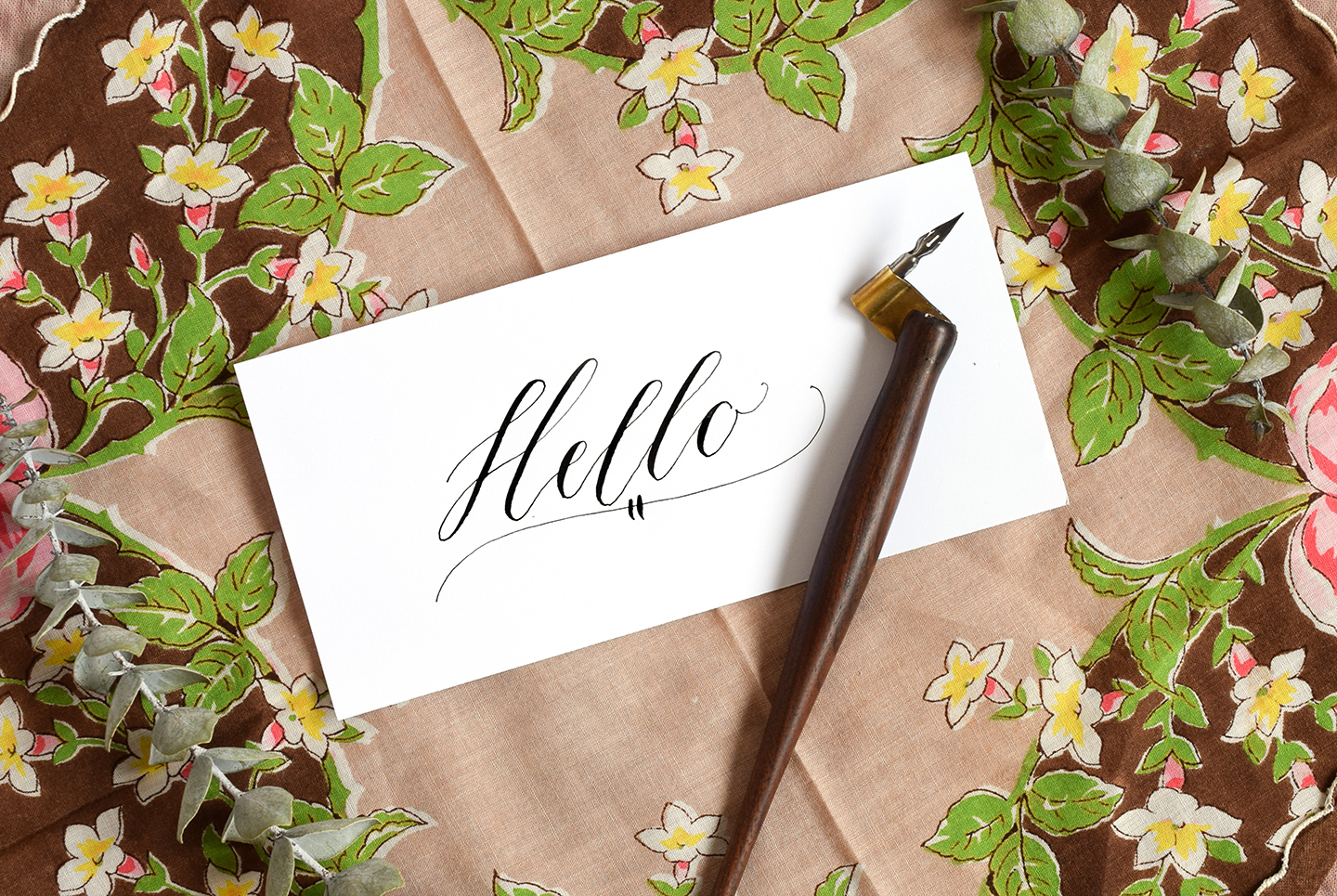
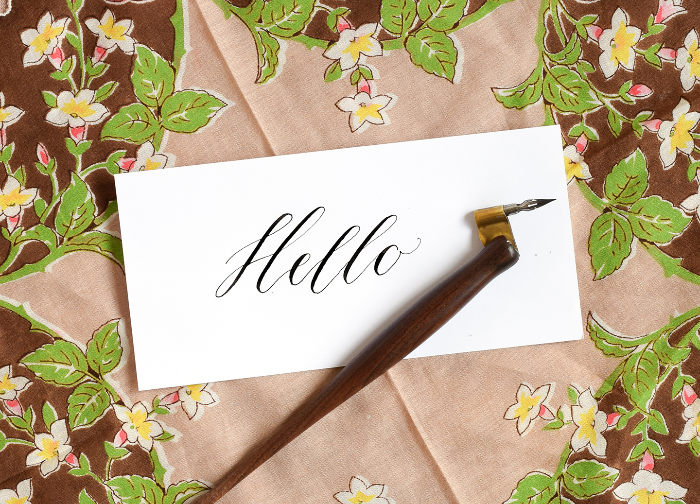
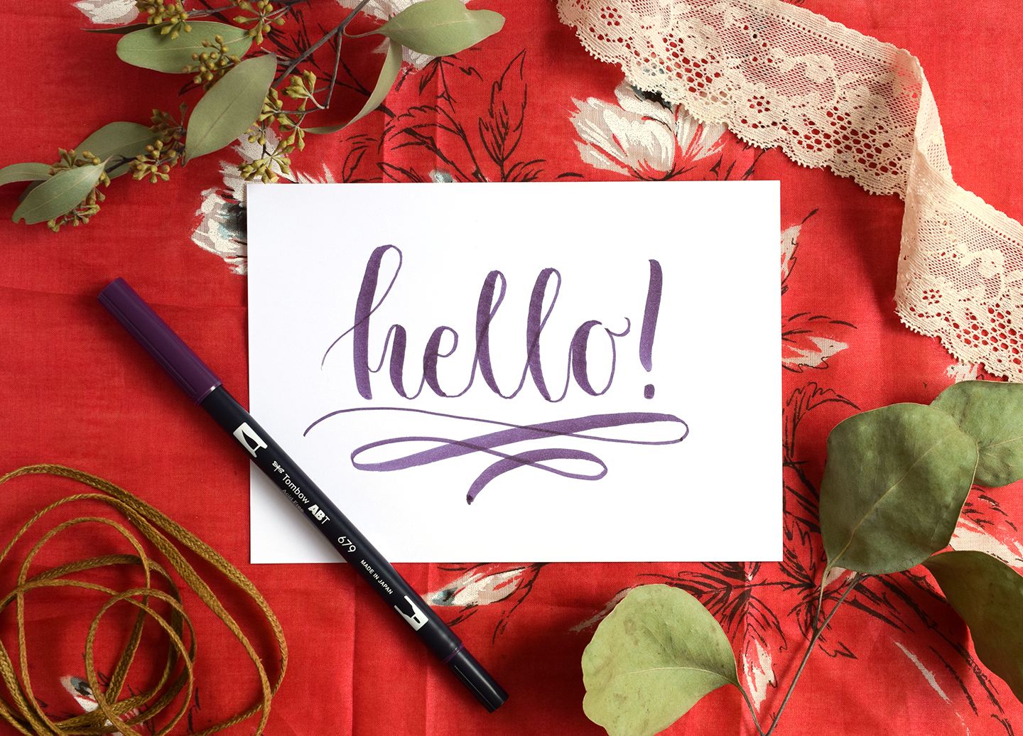
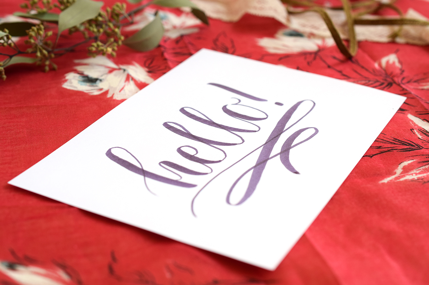
While wavy calligraphy flourishes are very basic, they provide a great way to add a subtle dose of elegance to any piece of lettering. To make a basic flourish, you’ll first want to write out your word; I have written “Hello” below in Kaitlin Style.

Next, position the tip of your pen under the calligraphy and to the left, then draw a wavy line that curves up at the end of the word. Draw two small lines to intersect the middle of the wavy line. You’re finished!

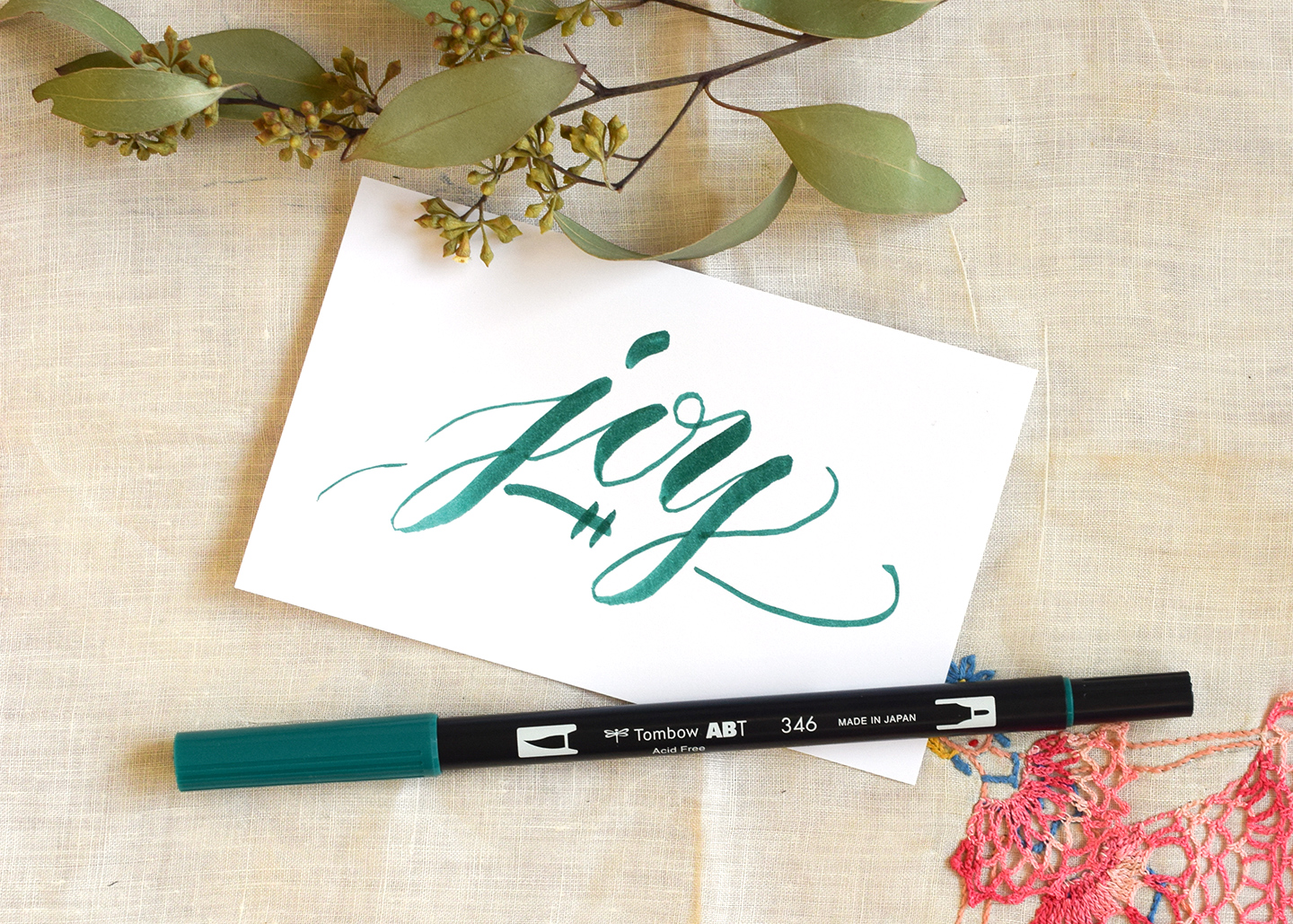
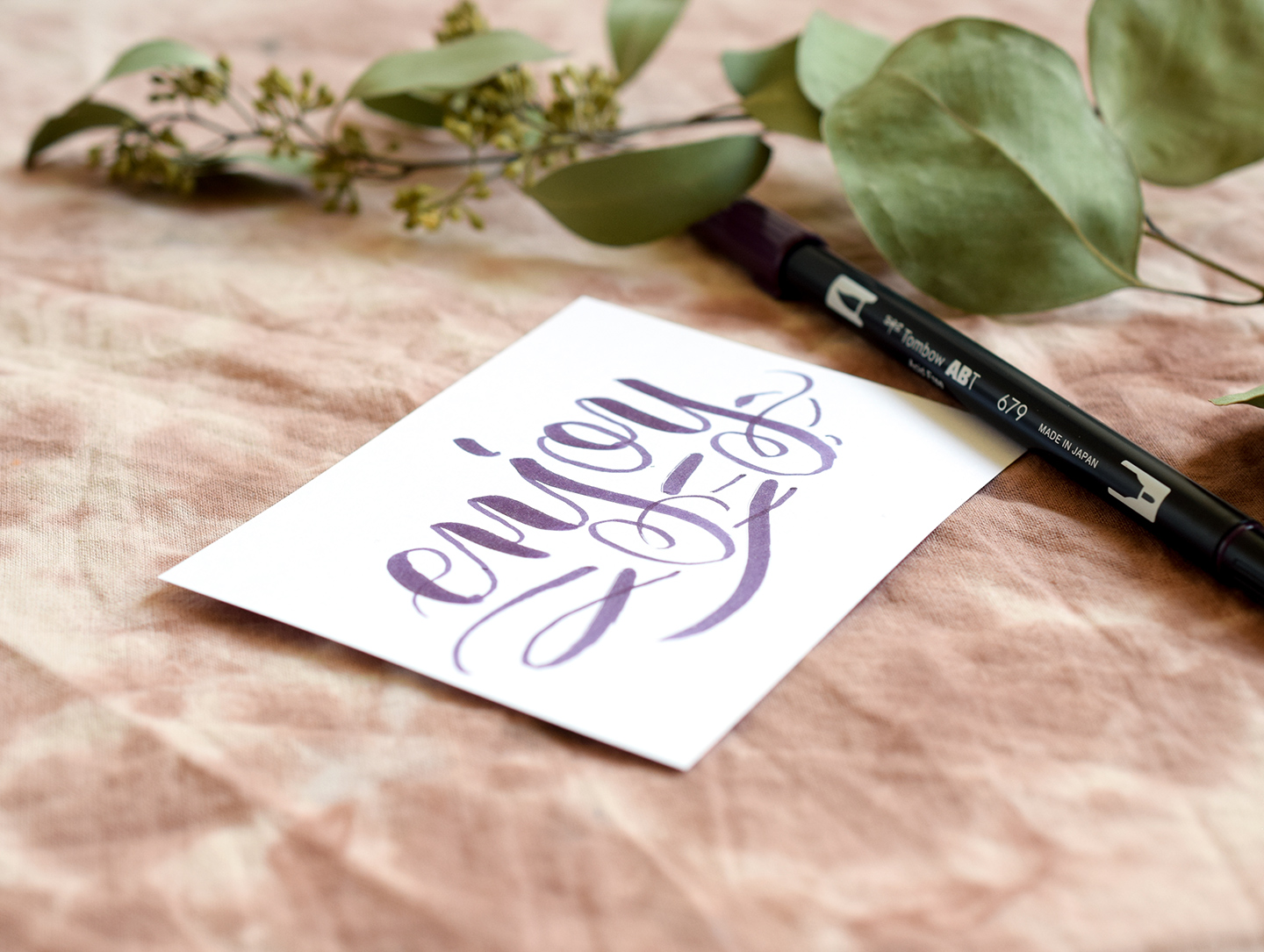
Now, you may have noticed that the “Hello” calligraphy pictured above doesn’t contain any descenders; descenders are the parts of letters like j, y, p, and q that hang below the rest of the letter. If you want to add a simple wavy flourish to a word that has letters with descenders — such as “joy” — then you’ll want to add breaks in the wavy line where the letters would intersect it. If that doesn’t make sense, don’t worry: it’s all in the video!

If you’re interested in learning more about how to create this type of flourish, you can get the lowdown in this video:
[vimeo 159303465]
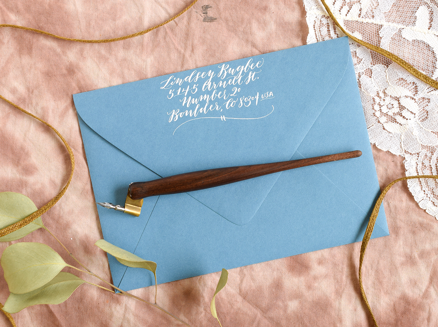
Wavy calligraphy flourishes are very versatile and can be implemented in practically any calligraphy project! I especially love using them to add some personality to return addresses. A simple flourish can help an otherwise plain address to stand out!

2. Swoops Calligraphy Flourishes

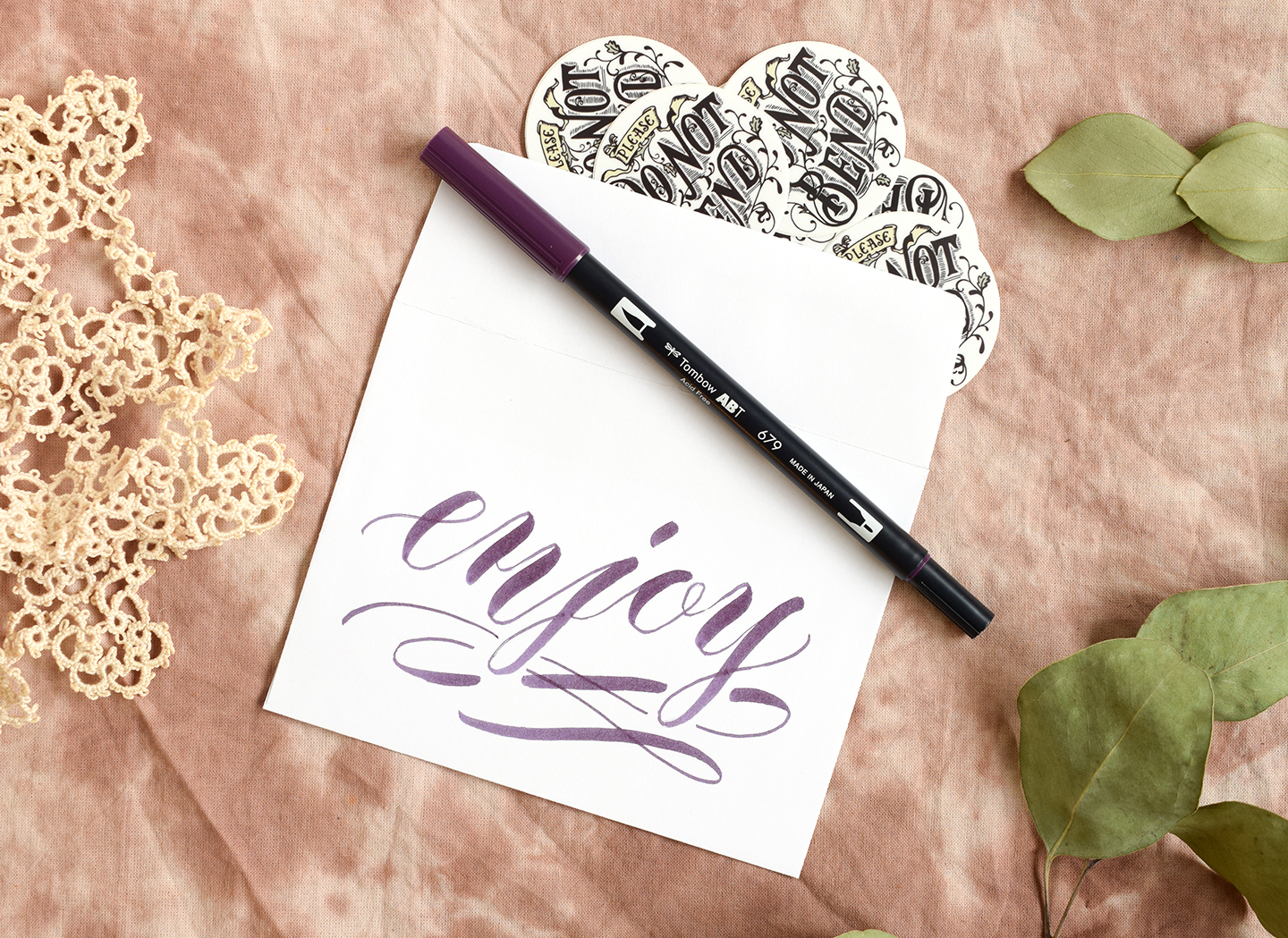
These calligraphy flourishes feature a few fun swoops to add pizazz to a word or phrase. This is probably the simple flourish concept I use the most; these types of flourishes turn out great every time! To make one, start by writing out your word; I am using Amy Style brush pen calligraphy in the photo below. Next, position your pen to the bottom left of the beginning of the word, and, exerting a minimal amount of pressure, pull the pen to the right. (Note that while I am using a brush pen in this example, the principle is exactly the same for dip pens!)

After you pull the pen to the right, you’ll pull it down to the left, exerting more pressure this time to make a thick stroke. At the bottom of that stroke, loop up to make another thin stroke to the right. Finally, loop up to make a final thick stroke to the left. Don’t worry if these instructions are hard to follow — the video will make it much easier to understand!

The stroke contrast is what makes the Swoops concept so beautiful!

If you are adding a swoops flourish under a word with descenders, you’ll want to make sure you don’t intersect the descenders; instead, leave spaces for them to shine! If you intersect the descenders with this flourish, it may be difficult for viewers to immediately ascertain what the word is because of everything that is going on beneath it.

While swoops calligraphy flourishes aren’t complicated to create, they are complicated to explain via text and photos! The video below should compensate for that; in it, you’ll learn how to make this calligraphy flourish under words with and without descenders.
[vimeo 159302689]
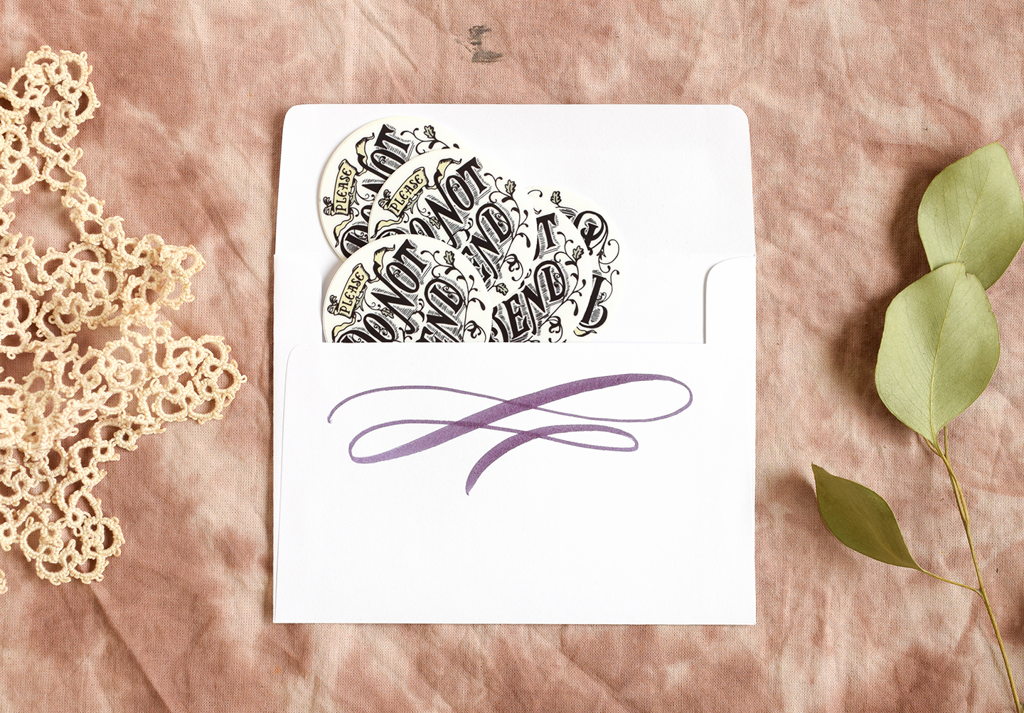
Swoops calligraphy flourishes can make any piece of paper look impressive, and I especially love making them with brush pens! This flourish is great to use on gifts; for example, when I send out stamps or gift cards to friends, I generally write “enjoy” on the front of the envelope, and underline it with a Swoops flourish.

You can add a swoop to the back of the envelope, too! There’s no such thing as too much embellishment. 🙂

3. Telephone Cord and Flower Calligraphy Flourishes

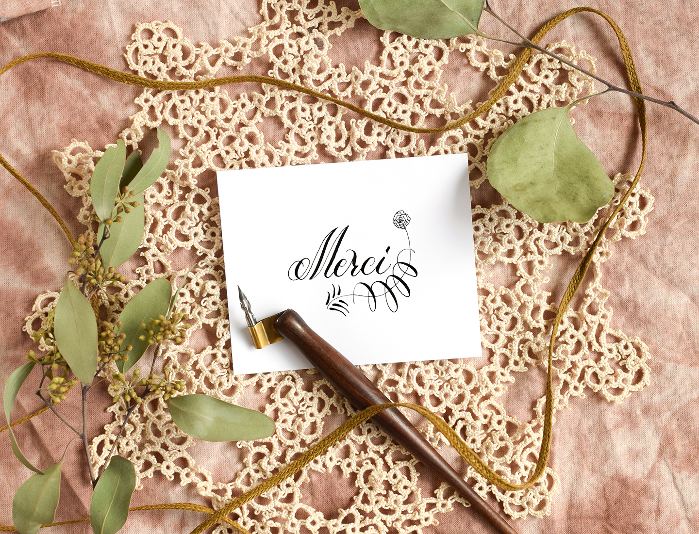
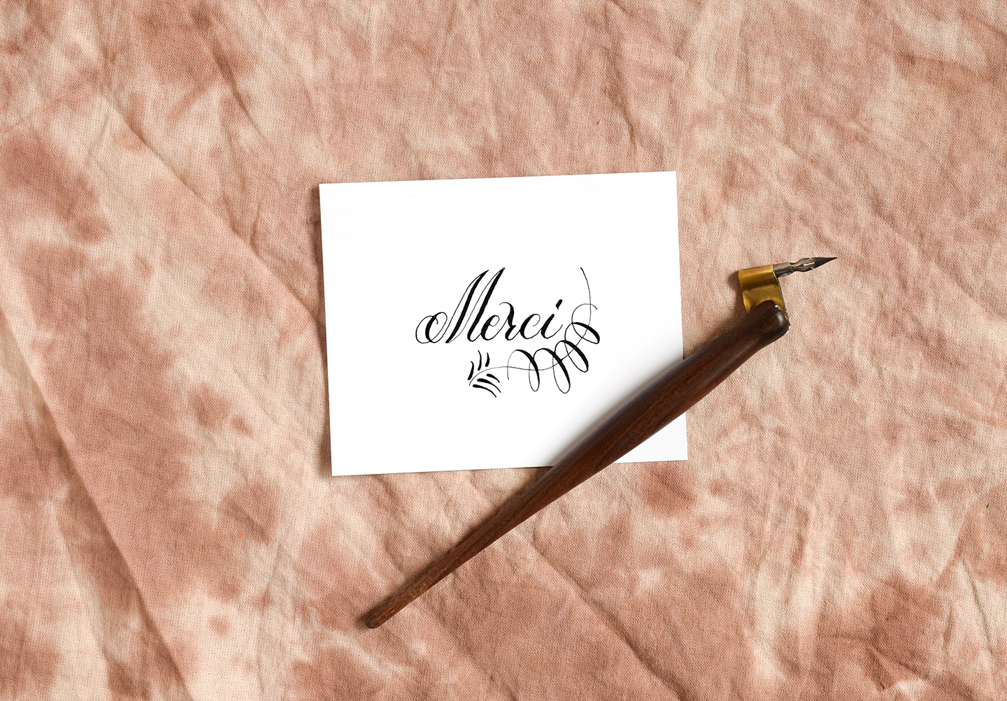
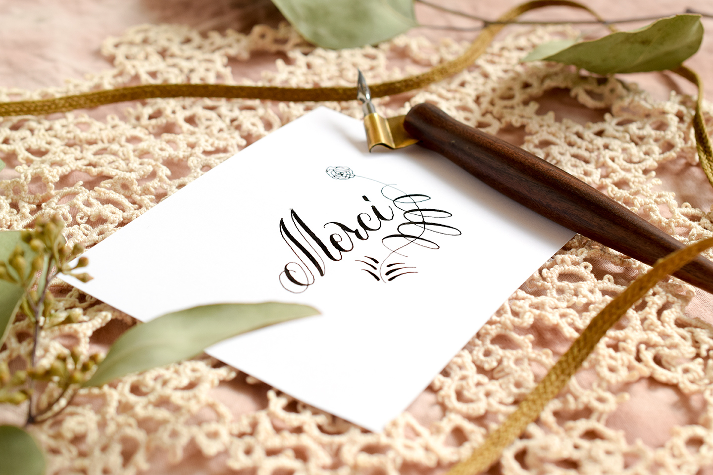
Yes, “Telephone Cord and Flower” is an odd name to give a calligraphy flourish … and yet, that’s what the flourish looks like (in the best of ways, of course). To create this flourish, you’ll start out with an elegantly-written word like the Janet Style “Merci” pictured below.

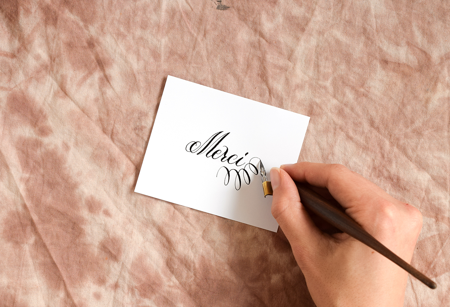
Next, draw a few curlicues (which I think look like a vintage telephone cord) under the calligraphy. The curlicues should “hug” the bottom right part of the word. If you want to practice your curlicues before writing, you can always bone up with the TPK free Simple Flourish Worksheet!

Once you have drawn the curlicues, draw a curved line that intersects all of the loops. The line should start at the bottom left of the curlicues, and make a generous curve around the right side of the word.

Next, draw six “leaves” at the base of the line. The leaves should have a lot of nice stroke contrast: the bottoms of the leaves should be thick, then taper to a point at the tips.

You’ll finish up the flourish by drawing a flower at the top. Any flower type is fine; whatever you like will work beautifully!

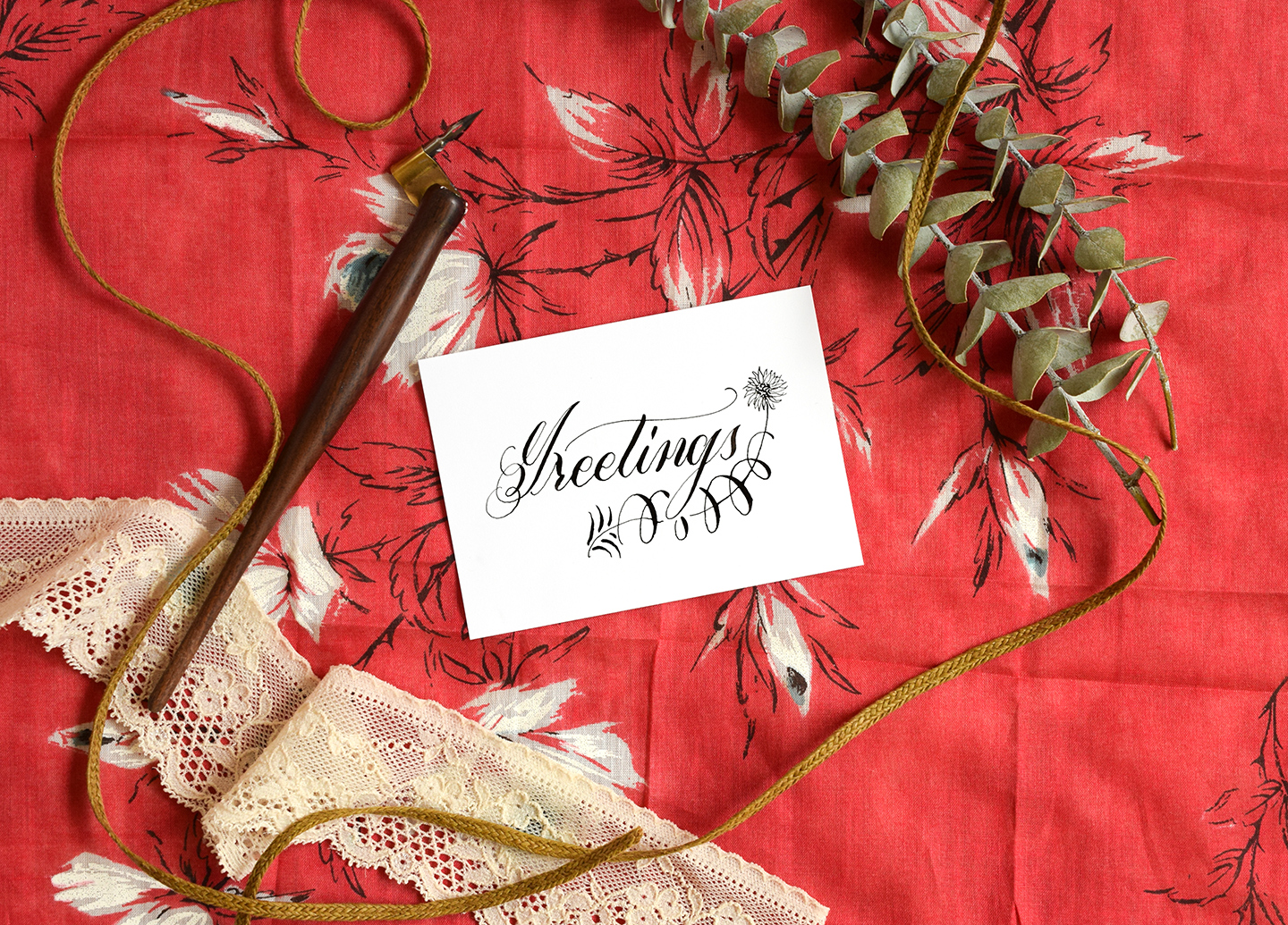
As with the first two types of calligraphy flourishes in this post, if your word features letters with descenders, you’ll want to leave a bit of space. You can see in the Janet Style “Greetings” calligraphy below that the swirls and line do not intersect the descender in the lowercase “g”!

If you’re curious about how to make this type of flourish, this video will have all the answers!:
[vimeo 159304425]
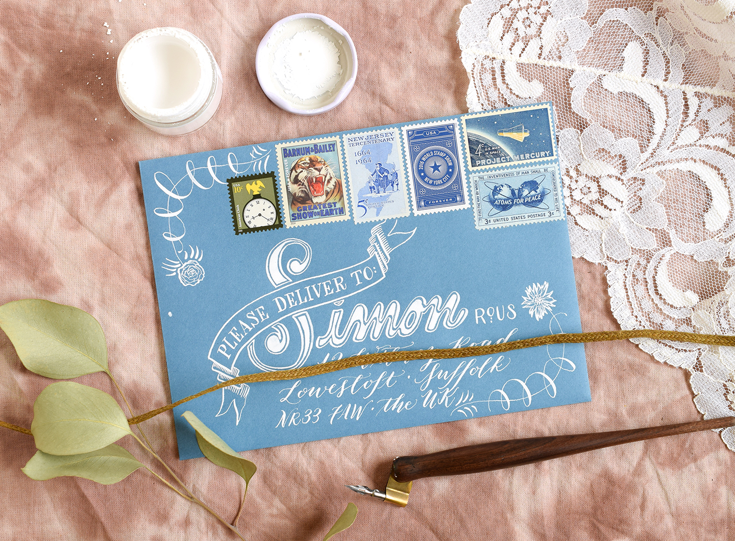
I love the uniqueness of this flourish, and for that reason, I think it’s a great element to include in the corners of your envelopes! Feel free to draw different flower heads depending on what kind of florals you like.

I hope you enjoyed today’s post, and that it gives you a spark of inspiration to help with your lettering endeavors! Remember that you can use these flourishes in many different situations; you’re absolutely not relegated to the examples shown in this post. If you’d like some shiny new writing utensils to make your flourishes with, don’t forget to enter the giveaway for the dip pens and nibs set; there will be three winners!
Have a great weekend, and we’ll reconvene on Tuesday in a post announcing the arrival of the Digitizing Artwork and Calligraphy video course. 🙂
Warmly,


